
Preview image. Unlock full-res
A 16-page corporate identity guide for industrial-gas company Air Products, built on a green and blue palette, oversized sans-serif headlines, and signature curved momentum lines.
Summary
A concise corporate identity guide for Air Products, an industrial-gas and clean-hydrogen company. The system pairs a vivid green-and-blue palette and oversized sans-serif headlines with a signature pair of curved momentum lines, all set against generous white space.
Visual description
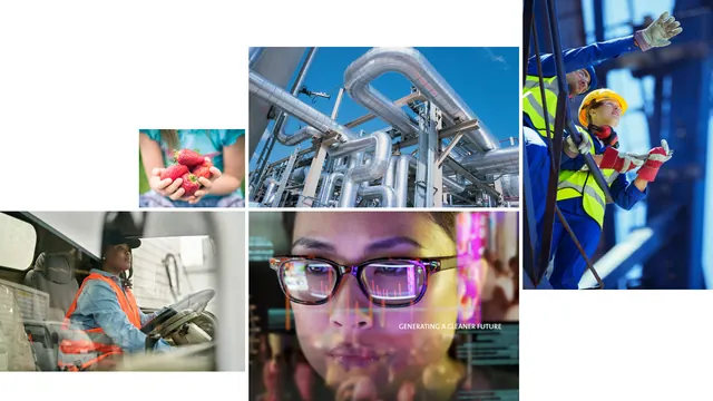
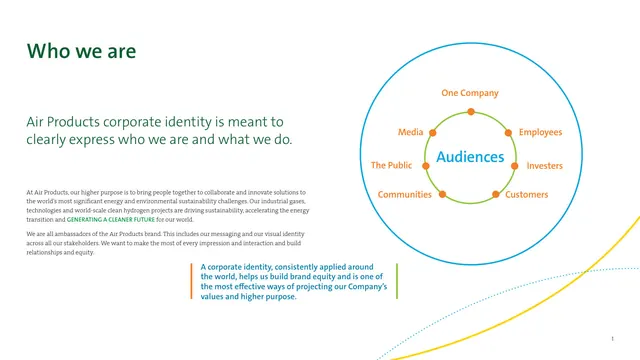
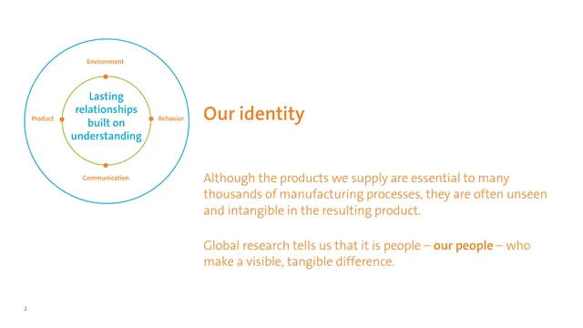
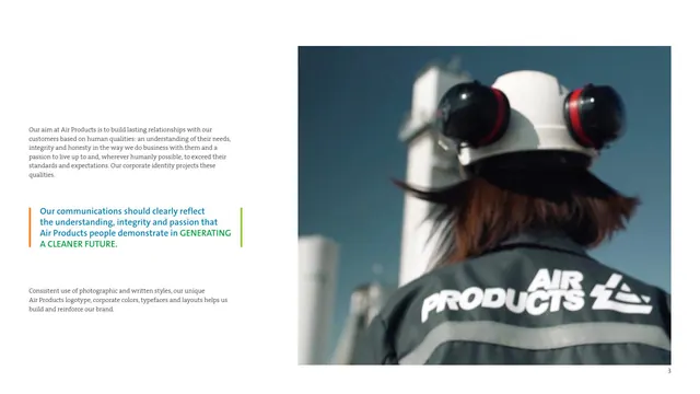
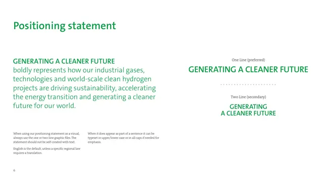
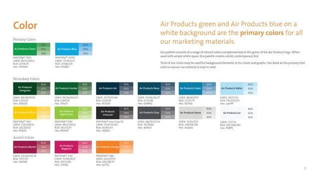
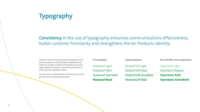
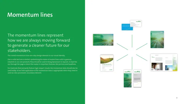
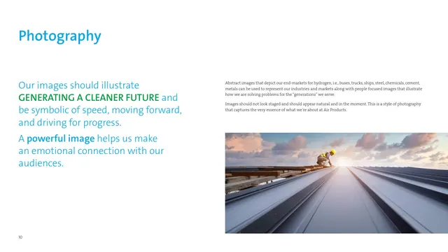
The deck runs on a light, white-dominant base with one or two full-color accent moments. Section titles are oversized sans-serif set in either Air Products green or blue, frequently paired with a body column in serif. A recurring left-or-right split puts a large headline and supporting paragraph on one side and either a full-bleed industrial photograph, a concentric-circle diagram, or a product-mockup constellation on the other. The brand's signature device is a pair of curved lines, one solid yellow and one dotted blue, that sweep across otherwise empty pages to imply forward motion. Color is handled rigorously: primary green and blue, a wide secondary range, accent merlot/magenta/orange, each shown with 80/60/40 percent tints and full Pantone, CMYK, RGB, and hex specs. Photography is candid and natural, leaning on workers in safety gear, industrial plant infrastructure, and warm human moments. The tagline GENERATING A CLEANER FUTURE recurs in green all-caps as a persistent endline.
Key takeaway
The two-curve momentum motif (one solid, one dotted, symbolizing solid-to-gas states of matter) is a distinctive, ownable graphic device that turns empty space into brand. The discipline of oversized colored headline plus serif body, anchored by lots of white, makes a heavy industrial company feel modern and light. The tint-ladder color system (every swatch at 80/60/40 with full specs) is a clean template for any guideline.
Reuse notes
A strong reference for B2B, industrial, energy, or hardware brands that want to feel contemporary and optimistic without going dark or trendy. The momentum-line device needs restraint and ample white space to read as elegant rather than decorative. The green-blue-with-bright-accents palette pairs well with candid documentary photography and is built to scale across web, vehicles, signage, and print.
From this deck: Air Products brand identity guidelines
View deck


More like this





Keep what you find
A free account saves references to boards and can send you a weekly email of picks based on what you save.
To see every result, go Pro.