
Preview image. Unlock full-res
Minimal Swiss-style brand guideline deck for a real-world-asset tokenization marketplace, built on an electric-blue and emerald accent system with a pixel-stair logo icon.
Summary
A clean, minimal brand guideline deck for Toyow, a multi-category real-world-asset (RWA) tokenization marketplace. The system runs on a tight palette of electric blue and emerald green against black and near-white, paired with a distinctive pixel-stair logo icon and oversized all-caps section titles.
Visual description
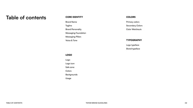
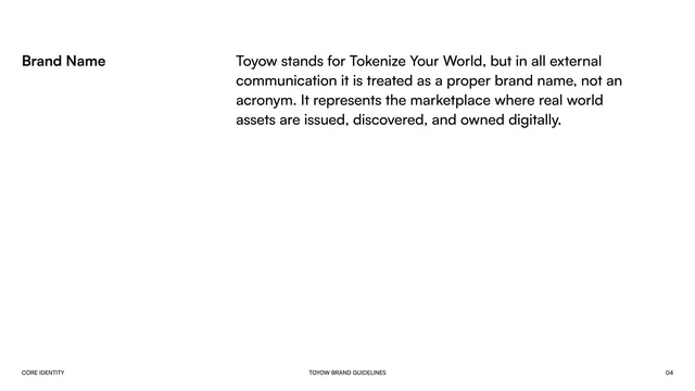
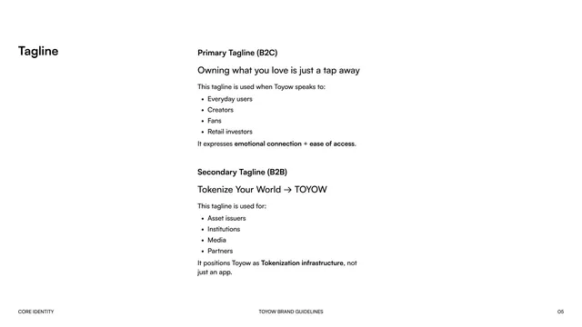
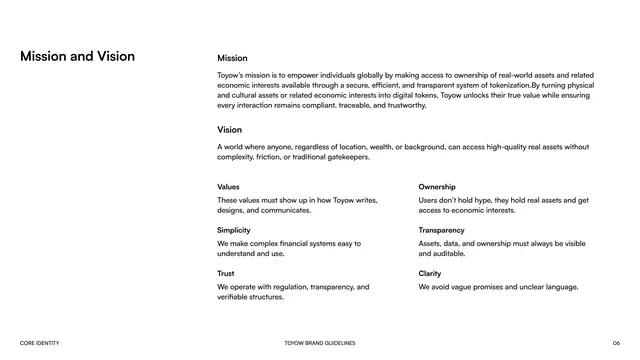
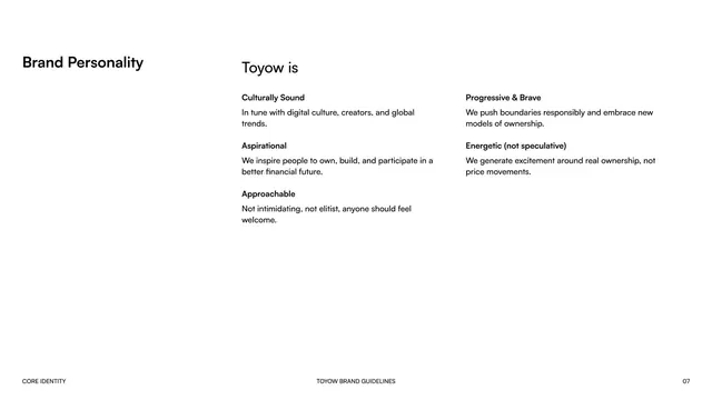
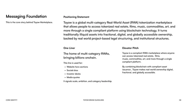
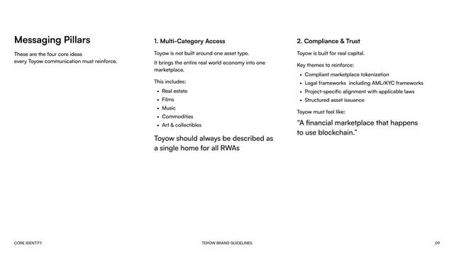
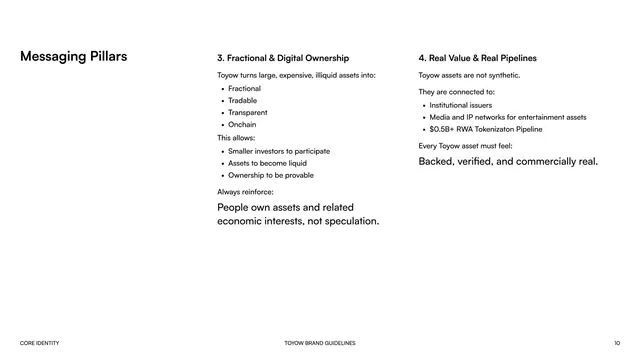
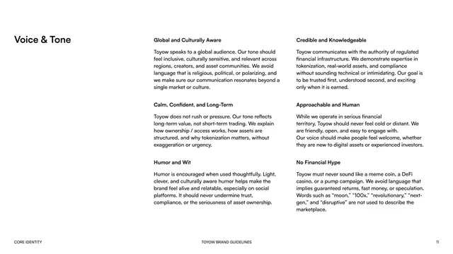
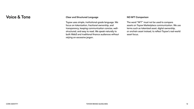
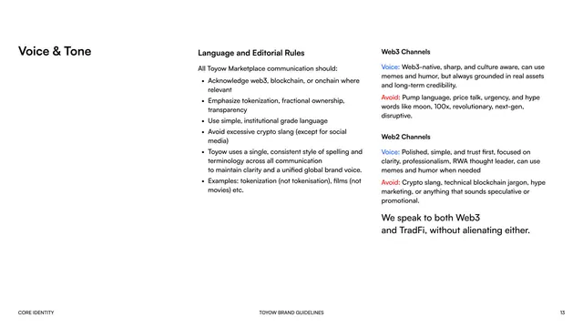
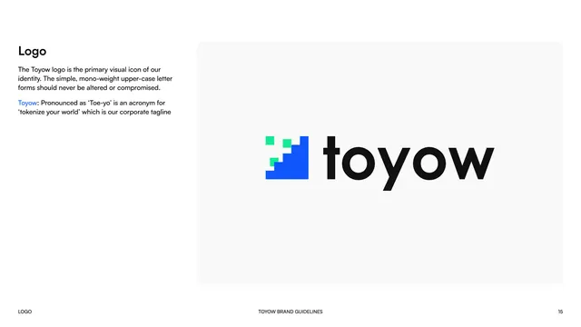
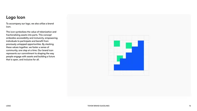
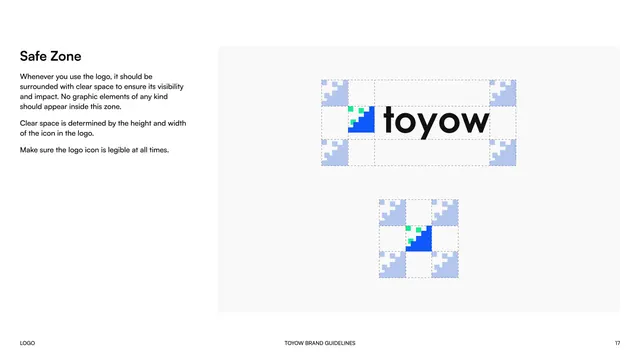
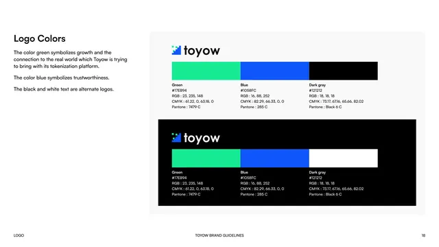
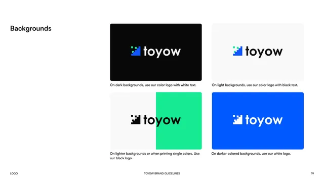
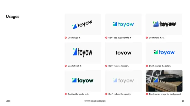
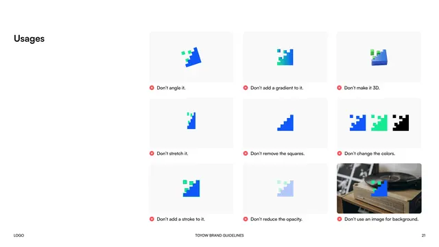
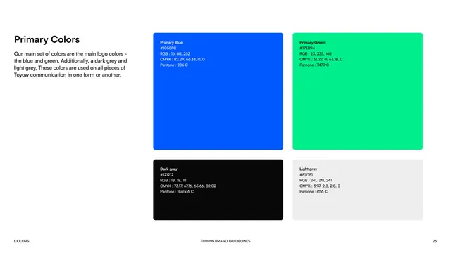
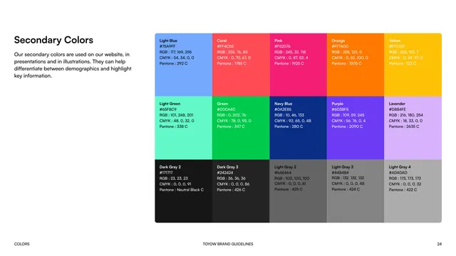
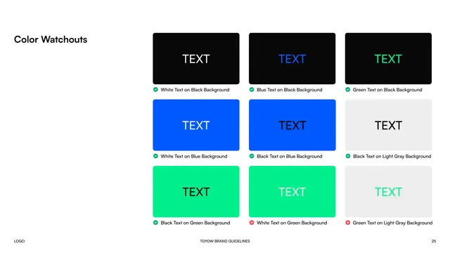
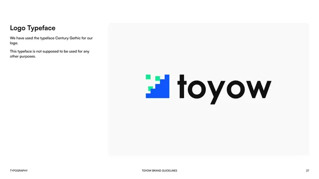
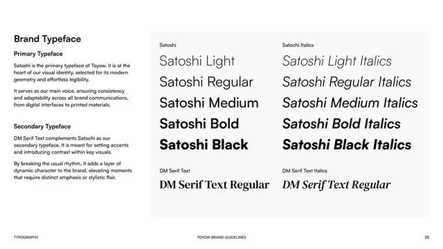
The deck uses a strict two-zone grammar throughout. Content pages are mostly white with a bold black section label set hard against the left margin and the body text held in one or two columns on the right two thirds of the page; every page carries a small footer line (section name, "TOYOW BRAND GUIDELINES", and a page number). Section divider pages flip to a full-bleed electric-blue field with the section name set in huge white all-caps type anchored to the lower-left corner. The brand color is a saturated electric blue (#1058FC) supported by an emerald green (#17EB94), with dark gray (#121212) and light gray (#F1F1F1) as neutrals. The logo is a lowercase "toyow" wordmark in a geometric mono-weight sans (Century Gothic) preceded by a pixel-stair icon built from blue and green squares stepping up like a bar chart. Color, logo, and usage pages present specimens inside soft light-gray rounded cards, including full hex/RGB/CMYK/Pantone specs, background-pairing rules, do-and-don't grids, and contrast watchout grids. Typography pages show Satoshi (primary, Light through Black plus italics) and DM Serif Text (secondary) as large laddered specimens.
Key takeaway
The pixel-stair "bar chart" icon is a smart, ownable mark that literally diagrams the brand idea (stacking fractional value, one step at a time). The two-mode layout system, calm white content pages versus loud full-bleed blue dividers, is an efficient way to give a minimal deck rhythm and navigation without decoration. The exhaustive color treatment (full print specs, explicit background pairings, and a pass/fail contrast watchout grid) is a reusable template for any color-disciplined identity.
Reuse notes
A strong reference for fintech, crypto, RWA, and other trust-forward tech brands that want to read as institutional and modern at once without going dark-mode. The electric-blue-plus-emerald pairing is high energy, so lean on the white content pages and generous whitespace to keep it credible rather than hype. The do-and-don't and color-watchout grids are worth lifting wholesale for any guideline deck that needs to police logo and contrast usage.
From this deck: Toyow brand guidelines
View deck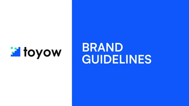

More like this







Keep what you find
A free account saves references to boards and can send you a weekly email of picks based on what you save.
To see every result, go Pro.