
Preview image. Unlock full-res
An 8-page Microsoft Bing trademark and logo guideline in a restrained corporate style, pairing a dark navy cover with clean white spec pages for the name, logo, and icon.
Summary
A compact 8-page Microsoft Bing trademark guideline that defines correct use of the Bing name, four-square logo, and gradient "b" icon. The defining move is a strict two-mode visual system: dark navy bookend pages frame a run of bright white, generously spaced spec sheets.
Visual description
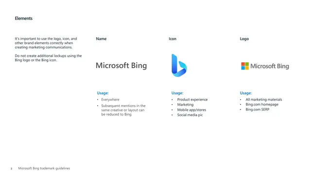
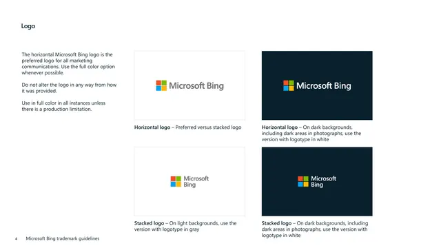
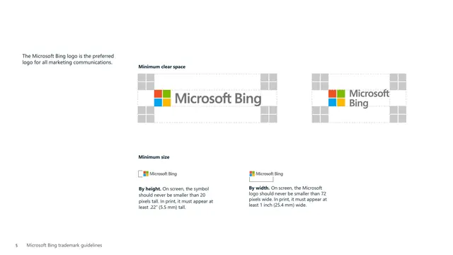
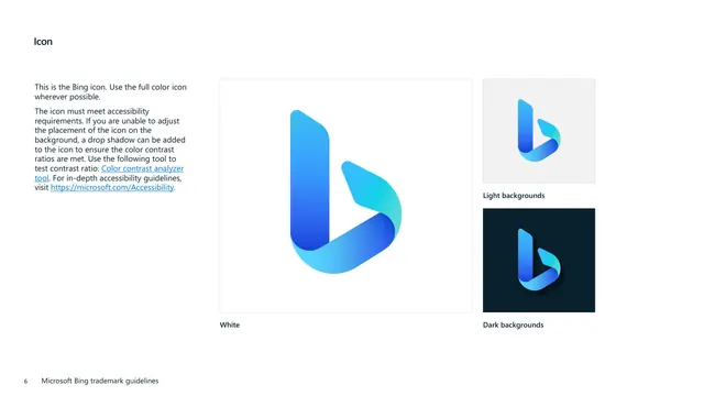
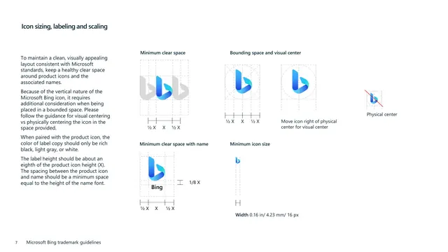
The deck opens and closes on a deep navy (near-black) cover holding the colored four-square Microsoft mark, the white "Microsoft Bing" wordmark, and a left-aligned two-line title in a clean white sans-serif, with a small date stamp low on the page. The interior pages flip to white backgrounds with a consistent grammar: a short bold section heading top-left, a narrow left column of body copy, and the visual material set out to the right. Pages use Segoe-style sans-serif throughout, with a recurring "Usage:" label in blue introducing bulleted do-lists. Content moves from a two-column text page on usage requirements, to a three-up Name / Icon / Logo elements page, to logo lockups shown on paired light and dark swatches, to clear-space and minimum-size diagrams built from gray placeholder grids, to the gradient blue icon shown large on white, light, and dark, and finally icon sizing and visual-centering construction diagrams with X-height measurement callouts. A running footer carries the page number and "Microsoft Bing trademark guidelines."
Key takeaway
The two-tone container idea: dark navy covers that bookend an otherwise all-white document give a plain spec deck a premium frame without adding any decoration. Also worth copying is the discipline of a fixed page template (heading top-left, copy column left, artwork right) so every rule page reads the same, and the consistent blue "Usage:" label that turns dry legal guidance into scannable do-lists.
Reuse notes
A strong reference for trademark, logo, and icon usage sections of any corporate brand book, especially tech and enterprise identities that need to feel official and restrained rather than expressive. The construction-diagram pages (clear space, minimum size, visual vs physical centering) are a clean template for documenting any logo or product icon. Note this is a narrow trademark-only guide: it covers name, logo, and icon mechanics but not color systems, full typography scales, photography, or voice, so pair it with a fuller identity guide if you need those.
From this deck: Microsoft Bing Trademark Guidelines
View deck

More like this








Keep what you find
A free account saves references to boards and can send you a weekly email of picks based on what you save.
To see every result, go Pro.