Preview image. Unlock full-res
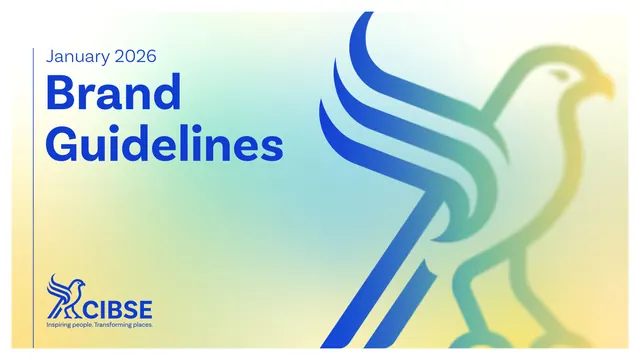
A 33-page CIBSE brand guideline built around a geometric hawk mark, a punchy blue plus mint-and-yellow palette, oversized sans headlines and signature diagonal-cut photography.
Summary
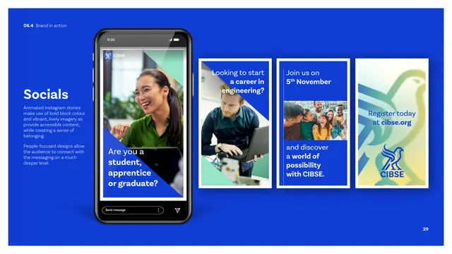
CIBSE's January 2026 brand guideline for a UK building-services engineering body, organised around a stylized geometric hawk mark and a high-energy blue, mint-green and yellow palette. The single defining move is the diagonal-cut device: a solid blue triangle slicing across photography that recurs as the system's connective tissue.
Visual description
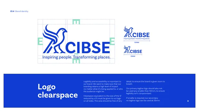
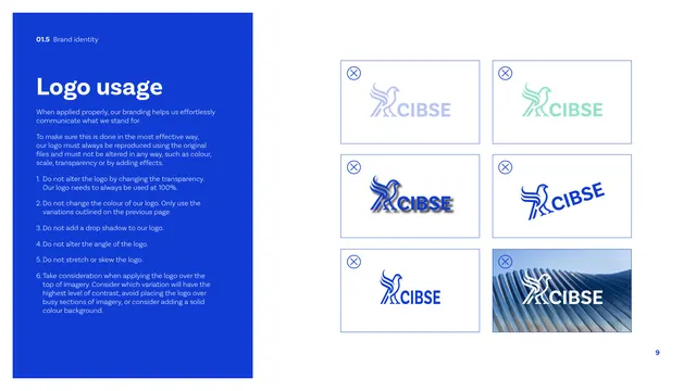
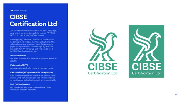
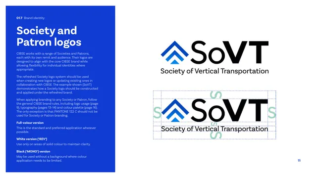
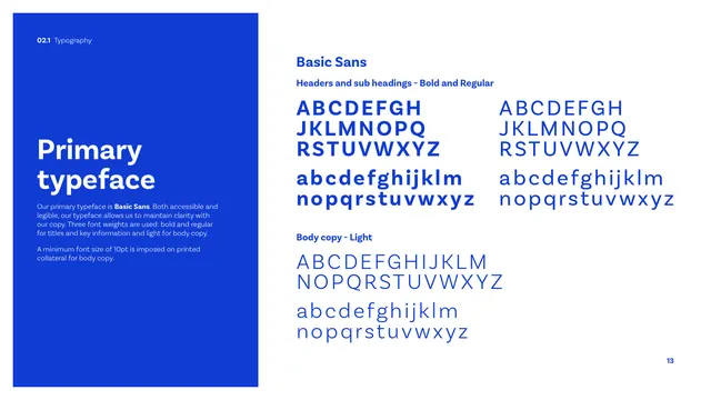
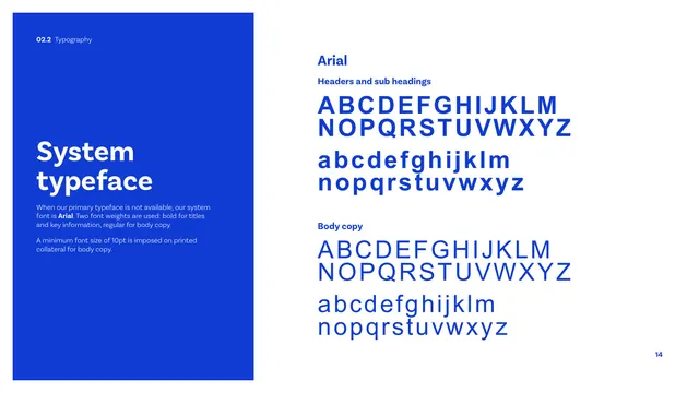
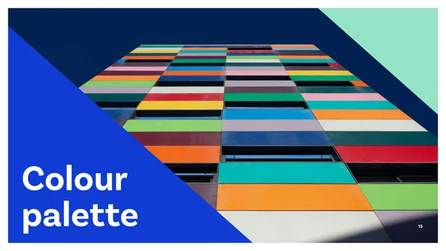
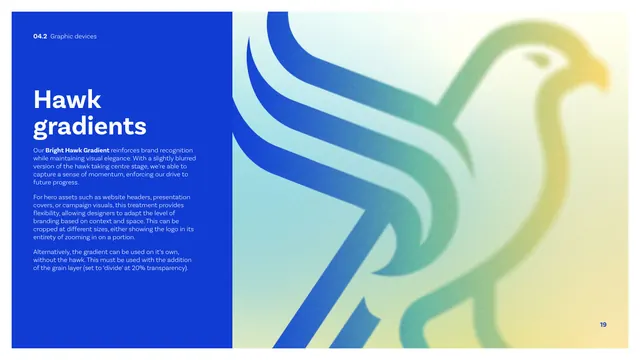
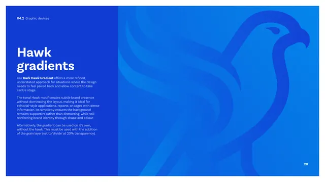
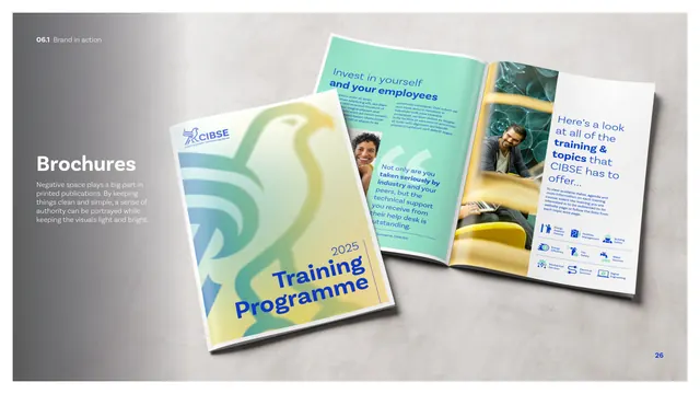
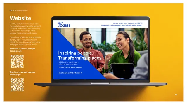
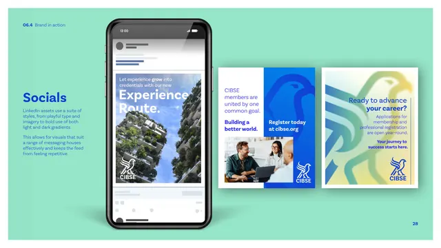
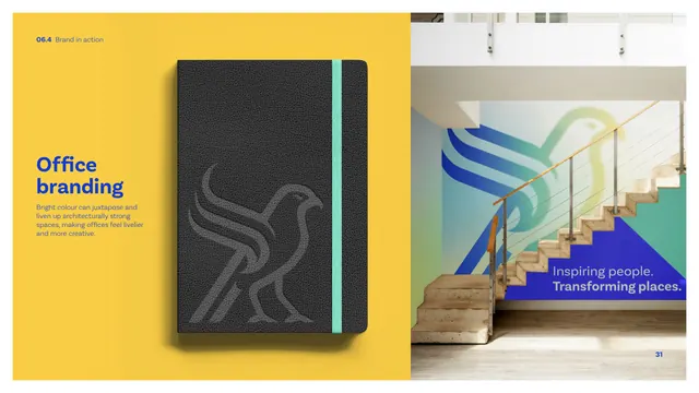
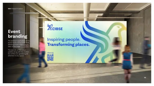
Thirty-three landscape pages on a white base, sectioned with full-bleed photographic dividers where a bold cobalt-blue triangle cuts in diagonally from the lower-left and an oversized white headline sits inside it (Brand identity, Typography, Colour palette, Graphic devices, Photography, Brand in action). Content pages use a recurring two-column grammar: a solid cobalt panel on the left holding a white oversized heading plus light body copy, and a white right field showing the artefact (logo lockups, type specimens, color chips, icon grid, gradient swatches, mockups). The hawk mark is a heavy monoline raptor that also appears blown up as a soft, grainy multi-color gradient (blue to mint to yellow) on the cover, thank-you and event pages, and as a tonal single-blue version for restrained layouts. Typography is all sans-serif: oversized bold Basic Sans headlines, light body. The color system is documented with Pantone, RGB, CMYK, hex and 25/50/75 percent tints. Two-tone blue-and-green flat icons, gradient background swatches, and richly colored authentic photography of people and architecture complete the kit.
Key takeaway
The diagonal blue triangle as a single repeatable device that brands every photo, divider and social asset without needing a logo on each one. The dual hawk-gradient treatment, one vibrant for hero impact and one dark-tonal for editorial calm, is a smart way to flex one motif across loud and quiet contexts. Also the disciplined left-panel / right-artefact page template that keeps 30-plus pages visually consistent.
Reuse notes
A strong reference for a membership body, institute, education or built-environment brand that wants to feel modern and energetic rather than stiffly corporate. The angled-cut device and oversized-headline-on-color-panel layout translate cleanly to decks, social, and print. Best paired with vibrant authentic photography; the system leans heavily on good imagery and the bright palette to carry it.
From this deck: CIBSE Brand Guidelines
View deck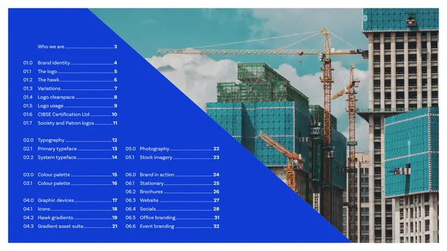













More like this








Keep what you find
A free account saves references to boards and can send you a weekly email of picks based on what you save.
To see every result, go Pro.