
Preview image. Unlock full-res
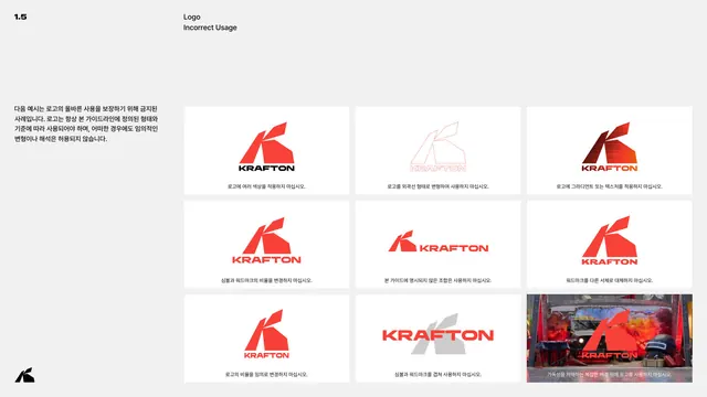
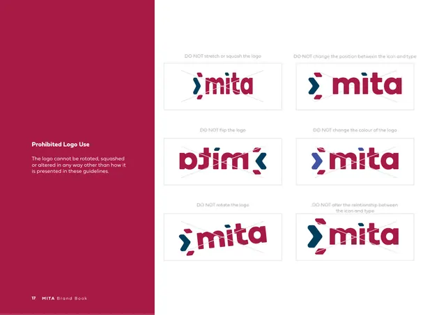
A 2x3 grid of crossed-out logo misuses, rotation, repositioning, removal, low-res, type-locking and color changes, each captioned with its rule.
Summary
The improper-usage page, a grid of six crossed-out examples showing exactly how the marks must not be altered, each labeled with its specific rule.
Visual description
Left column: "LOGOS AND MARKS" caps, an "Improper Usage" Spectral subhead, and one paragraph noting the marks are "locked" and may only come from official artwork. The right two-thirds is a 2x3 grid of don'ts, each a logo with a thin red diagonal slash and a small caption above: do not rotate, distort or change proportions (a tilted master logo); do not reposition or add elements (underlined wordmark); do not remove elements (monogram with cross missing); do not use low-resolution raster files (a pixelated master logo); do not lock type into the clear space (a crowded school signature); and do not change the colors (a gold-and-blue Torero mark). The red slashes are the only warm color on the page.
Key takeaway
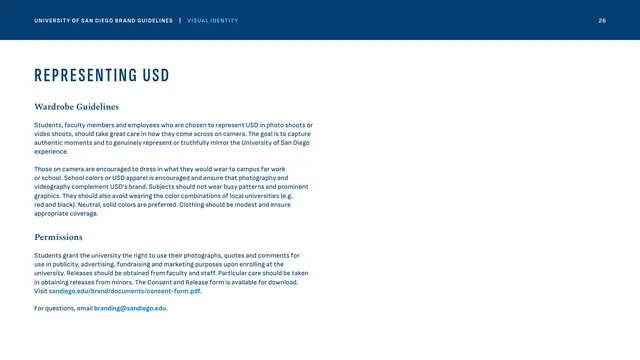
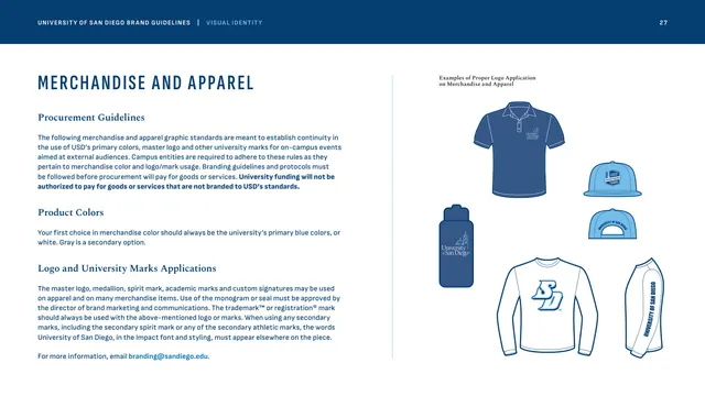
The compact "rule as caption, violation as image, red slash as verdict" grid is the clearest possible way to communicate misuse. Choosing six distinct, common failure modes (rather than abstract rules) makes the page genuinely preventive.
Reuse notes
A near-universal brand-guideline page; this is a tidy template to copy directly. The red-slash convention reads instantly across cultures. Place it immediately after the marks it protects, as is done here at the end of the Logos and Marks chapter.
From this deck: Improper logo usage, six dont examples
View deck



More like this





Keep what you find
A free account saves references to boards and can send you a weekly email of picks based on what you save.
To see every result, go Pro.