Preview image. Unlock full-res
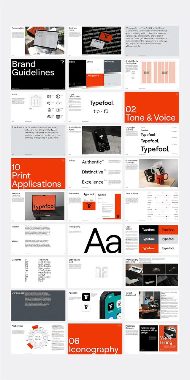
A multi-page brand guidelines layout tiled as a grid of spreads, covering logo, tone of voice, typography, print applications and iconography in a black, white and red-orange Swiss system.
Summary
A full brand guidelines book ("Typefool") presented as a tiled overview of roughly twenty pages, showing the whole identity system, logo, tone of voice, typography, applications and iconography, in one black, white and red-orange grid.
Visual description
Dozens of A4-style spreads are arranged in a tight multi-column contact-sheet grid. Recurring patterns carry the system: big numbered section openers ("02 Tone & Voice", "10 Print Applications", "06 Iconography") set the red-orange accent against mostly white pages, with occasional inverted black spreads for contrast. A giant lowercase "Aa" page anchors the type section; smaller pages show logo construction, grids, color chips, photography crops, and red callout boxes. Body content stays in a clean grey sans on white, so the bright orange and the section numbers do all the wayfinding.
Key takeaway
The numbered, accent-colored section dividers that repeat at scale and make a long document instantly navigable. Reserving one loud accent (red-orange) purely for numbers, callout boxes and dividers while everything else stays neutral.
Reuse notes
A reference for structuring any brand book, pitch deck, or design-system doc where consistency across many pages matters. The contact-sheet overview itself is worth reusing as a cover or case-study hero. Keep body pages monochrome so the single accent reads as a system, not decoration.
More like this

Keep what you find
A free account saves references to boards and can send you a weekly email of picks based on what you save.
To see every result, go Pro.