Preview image. Unlock full-res
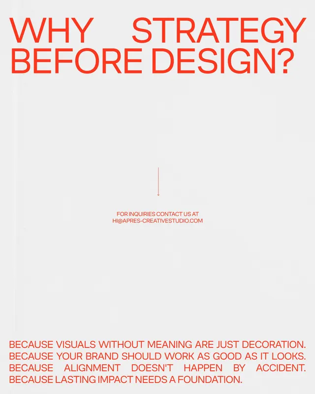
An off-white agency poster with a bold red sans-serif question stacked at the top and four anaphoric BECAUSE statements anchored at the bottom, joined by a thin downward arrow.
Summary
An off-white poster carrying a single red sans-serif question, "WHY STRATEGY BEFORE DESIGN?", across the top and answering it at the bottom with four left-aligned BECAUSE lines, all in the same red.
Visual description
The background is a near-white off-grey. At the top, a bold red grotesque sans sets the two-line headline in all caps, ranged left and stretched nearly edge to edge. The vast middle of the page is intentionally empty; only a thin vertical red line with a downward arrowhead runs through the center, above a small centered contact line ("FOR INQUIRIES CONTACT US AT HI@APRES-CREATIVESTUDIO.COM"). The bottom anchors four stacked lines, each opening with "BECAUSE" and justified flush to both margins so the word starts every line and the right edges align. The whole piece is two text masses, top and bottom, separated by a large field of white.
Key takeaway
Placing the question at the top and the answer at the bottom with empty space between forces a deliberate pause, the arrow literally walks the eye down. Justifying the four BECAUSE lines so they share both margins turns repeated copy into a tidy rectangular block with an anaphora rhythm.
Reuse notes
A clean format for a thesis-and-rationale statement, a values page, or a pitch slide. The single accent color on a neutral ground keeps it austere and confident. Mind that full justification only reads well when every line is roughly the same length; vary the copy and the spacing will get gappy.
More like this


Keep what you find
A free account saves references to boards and can send you a weekly email of picks based on what you save.
To see every result, go Pro.