Preview image. Unlock full-res
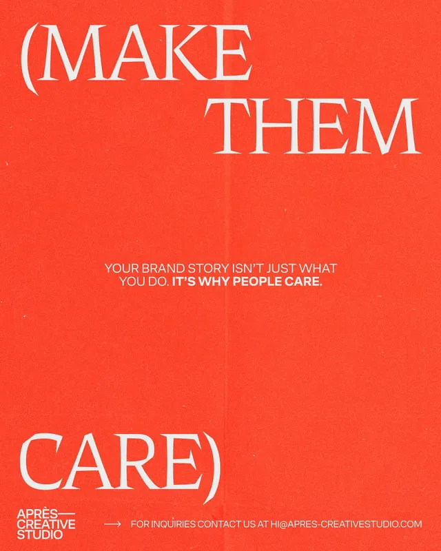
A red-orange studio poster setting the parenthetical line (MAKE THEM CARE) in giant white serif caps, bracketing a small sans-serif brand-story statement in the middle.
Summary
A red-orange agency poster that wraps the phrase (MAKE THEM CARE) in oversized white serif capitals, opening with the bracket and headline at the top and closing with "CARE)" at the bottom.
Visual description
The full bleed is a warm red-orange with a visible paper grain and a faint vertical fold line down the center. White serif display caps read "(MAKE" and "THEM" across the top two-thirds, with the closing "CARE)" set large in the bottom-left. Between them, dead center, sits a short two-line sans-serif statement in white: "YOUR BRAND STORY ISN'T JUST WHAT YOU DO." followed by the bolded "IT'S WHY PEOPLE CARE." A small lockup in the bottom-left corner reads "APRES CREATIVE STUDIO" in stacked bold sans caps, and a right-pointing arrow leads to an inquiries contact line running along the bottom edge.
Key takeaway
Splitting one bracketed phrase so the opening parenthesis anchors the top and the closing one anchors the bottom turns the whole poster into a single sentence you read top to bottom. The contrast of an elegant high-contrast serif at display size against a tight utilitarian sans for the body copy carries hierarchy with only two type sizes.
Reuse notes
A strong template for a one-line manifesto or campaign slogan from a studio or agency. Works best on a single saturated color with the grain texture to keep the flat red from feeling sterile. The bottom-edge contact bar is a clean way to add a CTA without breaking the type composition.
More like this

Keep what you find
A free account saves references to boards and can send you a weekly email of picks based on what you save.
To see every result, go Pro.