Preview image. Unlock full-res
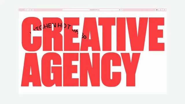
A browser-window hero where the words CREATIVE AGENCY fill the viewport in heavy red caps, with a small black studio name curving in an arc through the top line.
Summary
A web hero, shown inside a browser frame, where CREATIVE AGENCY is set so large in heavy red caps that the letters bleed off both sides, with a smaller black line of text bent into an arc across the first word.
Visual description
The capture sits in a light-grey desktop browser chrome with a centered address bar. Inside, on a white page, the headline "CREATIVE AGENCY" runs across two tightly-set lines of a bold condensed sans in saturated red, the glyphs scaled until they touch and overrun the left and right edges. Overlaid on the upper line, a much smaller line of black caps reading as the studio name is set on a downward-then-upward curved baseline, arcing through the red letterforms so black and red cross over each other. The composition is otherwise empty white, putting all weight on the type.
Key takeaway
The scale jump: one tiny curved label riding directly on top of a huge straight headline, in contrasting colors, so two messages share the same space. Pushing the headline past the canvas edges so the type feels too big to contain.
Reuse notes
A confident move for a creative-studio or portfolio landing hero where the type is the brand. Needs a genuinely heavy condensed face and disciplined kerning to survive at this scale. The curved overlay is a nice accent but keep it short; long curved text gets hard to read. Works best on a stark white or single-color field.
More like this


Keep what you find
A free account saves references to boards and can send you a weekly email of picks based on what you save.
To see every result, go Pro.