Preview image. Unlock full-res
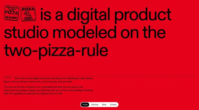
A bold red webpage for a digital product studio featuring large black sans-serif body text, two pizza-themed logos at top left, and descriptive paragraphs explaining the two-pizza-rule philosophy.
Summary
A bold studio brand homepage with a bright red background, black oversized typography, and two pizza logo badges that introduce the studio's organizational philosophy of the two-pizza-rule.
Visual description
Solid red background with black sans-serif text. Two pizza logos (small, bordered badges) positioned at top left. Large black headline and body text reads "is a digital product studio modeled on the two-pizza-rule". Below, additional black body text explains the studio's approach. Navigation buttons (Profile, Services, Work, Contact) in white outline sit at the bottom right.
Key takeaway
Demonstrates striking monochromatic contrast (red+black) as a way to make bold, energetic brand statements. The playful pizza badges humanize a potentially stark color pairing. The large, generous typography hierarchy makes the core message immediate and memorable.
Reuse notes
Strong template for service studios or agencies wanting to project confidence and energy. The red background is visually demanding and works best for limited-text compositions. The two-color approach (red and black only) requires confident typography and hierarchy to remain readable at this scale.
More like this



Keep what you find
A free account saves references to boards and can send you a weekly email of picks based on what you save.
To see every result, go Pro.