Preview image. Unlock full-res
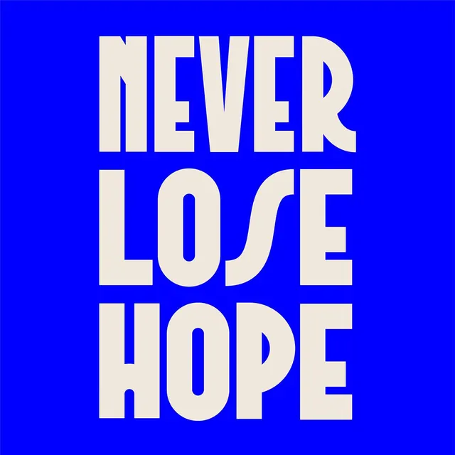
A square poster stacking NEVER LOSE HOPE in three lines of cream condensed display caps on an electric-blue field, with quirky ligature-style letter joins.
Summary
A square type-driven poster setting the slogan NEVER LOSE HOPE in three stacked lines of cream condensed caps on a saturated electric-blue ground, animated by playful joined-letter ligatures.
Visual description
Full-bleed pure-blue (near-RGB-blue) background fills the frame edge to edge. Three words sit centered and stacked, NEVER over LOSE over HOPE, in a heavy condensed display sans set in warm cream, each line sized to nearly span the width so the block reads as a solid tower of type. The letterforms have a custom, slightly rounded character: the S in LOSE swells into a fat looping curve, and several characters fuse where they meet, giving the otherwise rigid caps a hand-made, almost art-deco flourish. There is no imagery, no secondary text, just the two-color contrast doing all the work.
Key takeaway
Maximizing a short slogan by stacking it as full-width condensed caps so the words become the entire composition, plus the custom swollen-S and fused-letter joins that keep a tight all-caps block from feeling mechanical. The two-color cream-on-electric-blue pairing is a ready-made high-impact duotone.
Reuse notes
Reach for this when a single phrase needs to be the whole graphic: merch, cover art, quote cards, gym or motivational branding. The fused ligatures only work in display sizes, so do not shrink it to caption scale. The intense blue is loud, best on its own rather than competing with photography.
More like this


Keep what you find
A free account saves references to boards and can send you a weekly email of picks based on what you save.
To see every result, go Pro.