Preview image. Unlock full-res
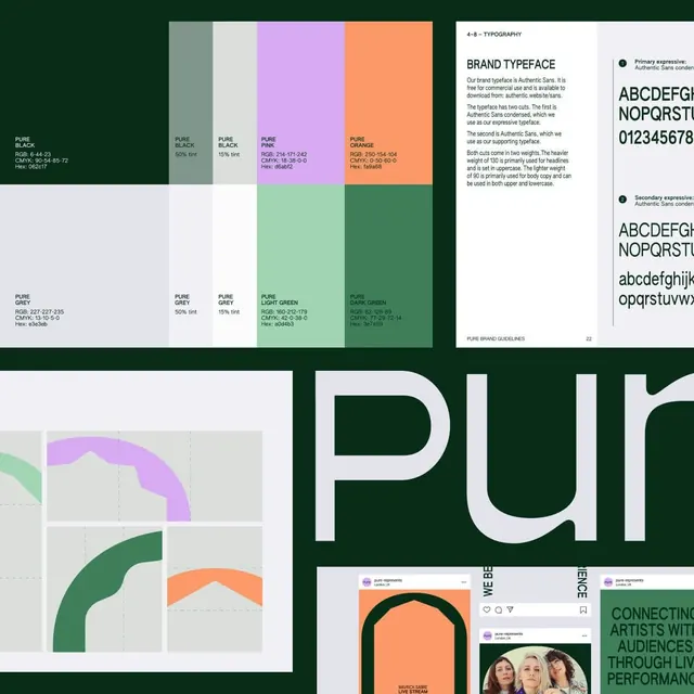
A montage of Pure brand-guideline pages, pairing a forest-green-and-pastel swatch grid with full color specs, an Authentic Sans type page, and logo-grid and social applications.
Summary
A composite of pages from the Pure brand guidelines (Pure Represents, London), showing a labeled color system with RGB/CMYK/Hex values, a typography page for Authentic Sans, and logo-grid and Instagram applications.
Visual description
The top band holds two spec pages. The left is a color grid: large blocks of Pure Black, Pure Pink (lavender), Pure Orange (coral), and greens, each with its tints and full Pure Black / Pure Grey / Pure Light Green / Pure Dark Green specifications printed beneath as RGB, CMYK, and Hex. The right page is a clean typography spread headed BRAND TYPEFACE, explaining Authentic Sans condensed and its weights, with large ABC and 0123 specimens. Below, an oversized lavender-and-grey pur wordmark bleeds off a deep forest-green field, beside a logo-construction grid showing rounded arch shapes in green, coral, and lavender on dashed guides, and Instagram post mockups for pure-represents with arch graphics, a CONNECTING ARTISTS WITH AUDIENCES headline, and a group photo.
Key takeaway
Setting every brand color as a big block with its tint ramp and full RGB/CMYK/Hex caption underneath is the clearest possible color-page layout to copy. The forest-green-with-coral-and-lavender combination is an unusual, ownable palette. Showing the logo on a construction grid and then live in social mockups on the same montage proves the system works end to end.
Reuse notes
A reference for building or auditing a guidelines document, especially the color and typography spreads, which are near-templates. The palette suits an agency, arts, or events brand wanting warmth without going corporate-blue. Use the arch-shape construction grid idea when an identity is built from a small kit of geometric brand elements rather than a single logo.
More like this


Keep what you find
A free account saves references to boards and can send you a weekly email of picks based on what you save.
To see every result, go Pro.