Preview image. Unlock full-res
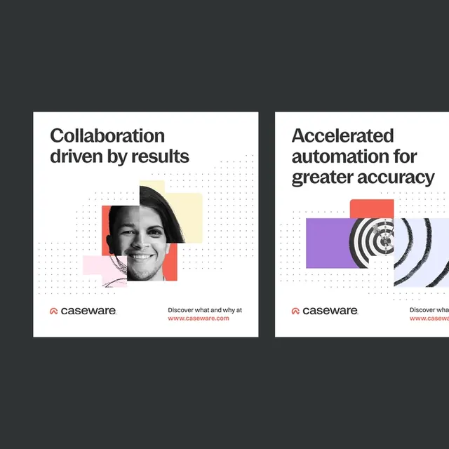
Caseware brand marketing collateral using layered rectangular color blocking, black and white photography, dotted texture overlays, and a minimal sans-serif hierarchy to communicate automation and collaboration.
Summary
Caseware marketing cards layering colored rectangles over black and white headshots and abstract icons, with dotted texture accents and tight sans-serif copy selling automation and collaboration.
Visual description
Two side-by-side white cards on a dark background. Left card pairs a black and white female headshot with a red rectangle overlay and pink and yellow geometric accent blocks, beneath which sits bold sans-serif copy "Collaboration driven by results" and a small Caseware logo with orange accent line plus a call-to-action URL. Right card features an abstract icon of concentric circles (target or ripple motif) in gray and orange, layered with a purple rectangle and red accent block, topped by sans-serif copy "Accelerated automation for greater accuracy". Both cards use subtle dotted texture patterns (small circles) behind the secondary elements and maintain consistent grid alignment. Text is clean, left-aligned within the white field, and the Caseware brand mark appears in both cards.
Key takeaway
The rectangular color blocks as a frame device that directs attention and adds visual weight without being heavy. The pairing of black and white imagery with bright accent colors (red, orange, pink) creates professional but energetic impact. Dotted textures add surface detail without overwhelming the hierarchy.
Reuse notes
Highly effective for B2B software and automation narratives, especially when you want "efficiency" without looking corporate. The color blocking works whether the image is portraiture or icon-based. Scale these cards down to business card or email-header size and the impact holds. Avoid on complex photographic backgrounds.
More like this






Keep what you find
A free account saves references to boards and can send you a weekly email of picks based on what you save.
To see every result, go Pro.