Preview image. Unlock full-res
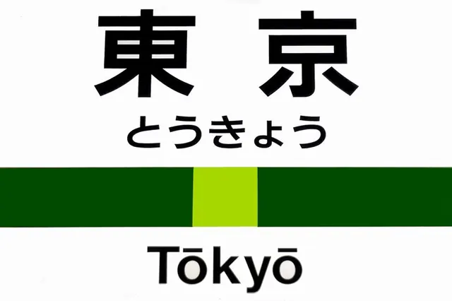
A JR-style station sign for Tokyo, stacking the kanji and kana name above a green line-color bar with a lime station-position block, then the romaji Tokyo.
Summary
A photographed Japanese railway station nameplate for Tokyo, following the JR convention: black kanji and smaller kana on white, a horizontal dark-green line bar with a bright lime block marking this station's position, and the romaji name beneath.
Visual description
White panel, strictly stacked and centered. At the top, the station name 東京 sits in large bold black sans-serif kanji, with the hiragana reading とうきょう in a lighter weight directly below. A full-width horizontal bar in dark forest green crosses the middle; a single bright lime-green segment is inset into the bar slightly off-center, the standard cue for where the current station falls along the line. Under the bar, "Tokyo" appears in clean black sans-serif romaji with a macron over the o. The image is a real-world photo of the sign, so there is faint surface sheen, but the design itself is flat, high-contrast, and rigidly aligned to a vertical axis.
Key takeaway
The position-indicator move: a colored line-bar with one brighter inset block tells riders both which line they are on and exactly where this station sits, all in one graphic. Stacking three scripts (kanji, kana, romaji) in descending size is a clean trilingual hierarchy for any multilingual wayfinding system.
Reuse notes
A canonical transit-wayfinding reference for signage, transport identity, or any system needing line-color coding plus multilingual labels. The dark-green/lime pairing is a specific line color; treat it as a slot to recolor per route. Works best at large physical scale with strong contrast for glance-reading.
More like this




Keep what you find
A free account saves references to boards and can send you a weekly email of picks based on what you save.
To see every result, go Pro.