Preview image. Unlock full-res
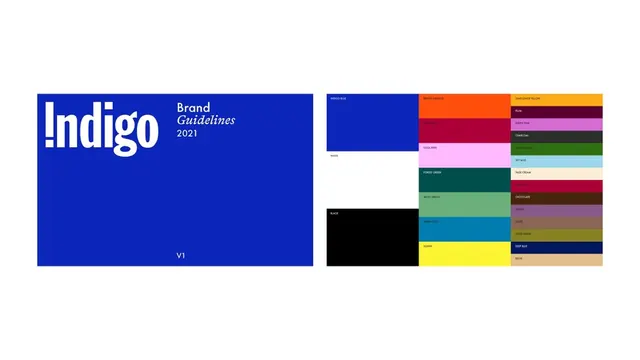
A brand guidelines cover in flat indigo blue paired with a full color system laid out as labeled blocks, from indigo, white and black anchors to a wide spectrum of named accents.
Summary
Two brand-guideline pages side by side: a flat indigo cover titled "Indigo Brand Guidelines 2021 V1," and a color-system page that arrays the full palette as labeled solid blocks.
Visual description
Left page is a saturated indigo rectangle. The wordmark "Indigo" sits large in white, its lowercase i rendered as a stencil-style bar so it reads as an exclamation point. To its right, "Brand" in upright sans, "Guidelines" set in italic serif, and "2021" stacked beneath; "V1" anchors the bottom. Right page is a tight mosaic of color blocks. A left column stacks the three anchors, INDIGO BLUE, WHITE, and BLACK, as large fields. Two further columns hold named accent swatches in smaller stacked bars: BRIGHT ORANGE, BURGUNDY, COOL PINK, FOREST GREEN, MOSS GREEN, WARM BLUE, SUNNY, SUNFLOWER YELLOW, PLUM, PURPLY PINK, CHARCOAL, GRASS GREEN, SKY BLUE, PAGE CREAM, HARD RED, CHOCOLATE, PURPLE, TAUPE, OLIVE GREEN, DEEP BLUE, BEIGE. Each block carries a small caps label in the contrasting tint. No imagery, just the system itself.
Key takeaway
The named-block color system: every swatch is a full bleed rectangle with a plain spoken label inside it, so the palette reads as usable inventory rather than decoration. Anchoring with three large primaries on the left and letting the accents sit smaller keeps a big spectrum from feeling chaotic.
Reuse notes
A clean reference for the color page of any brand book or design-system deck. The friendly swatch names ("Sunny," "Page Cream") are worth borrowing to make a palette memorable to non-designers. Pair the indigo cover treatment, plain sans plus a single italic serif word, as a recurring section divider.
More like this




Keep what you find
A free account saves references to boards and can send you a weekly email of picks based on what you save.
To see every result, go Pro.