Preview image. Unlock full-res
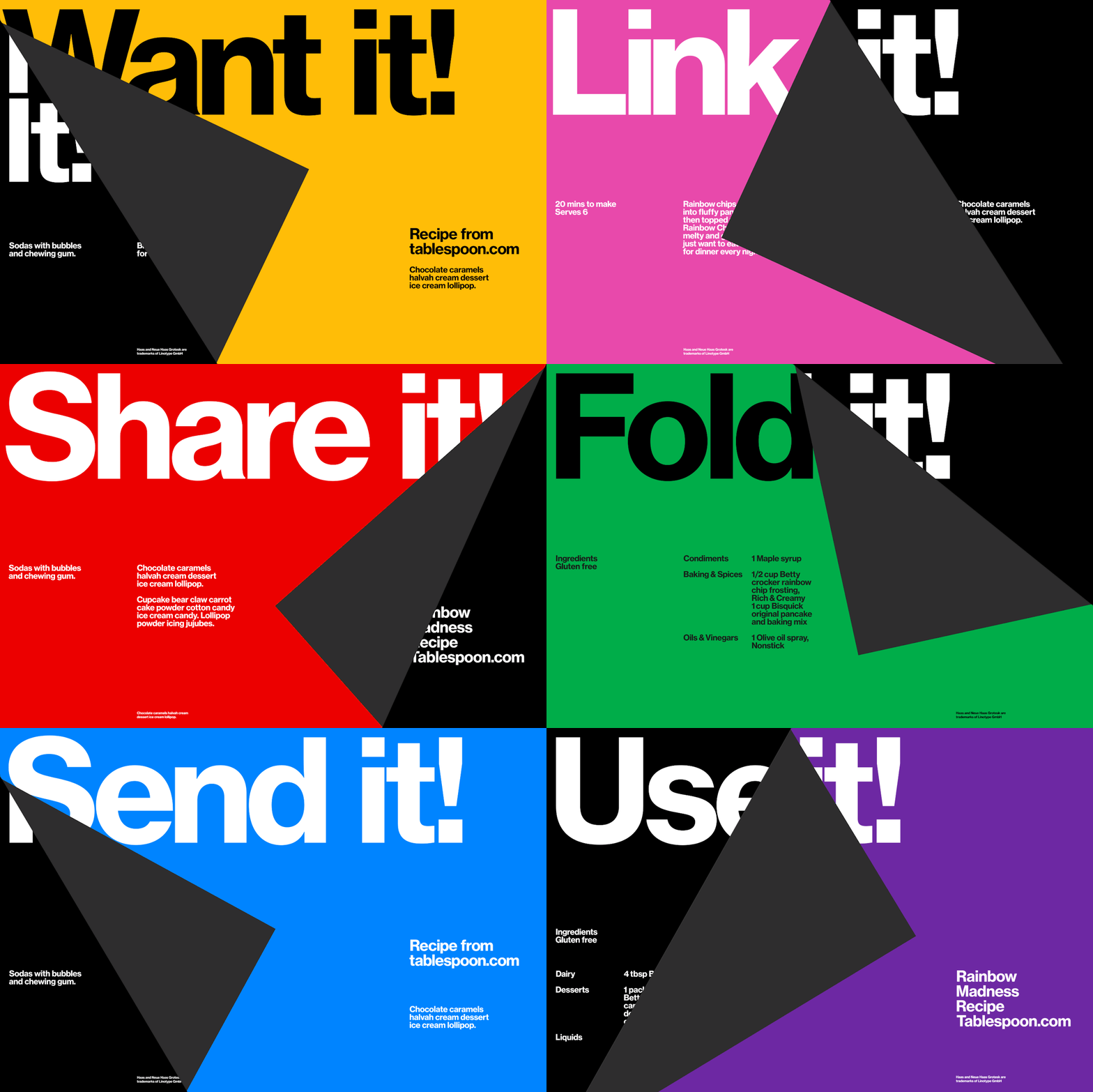
A high-contrast food poster splitting an amber-yellow field with a dark grey diagonal wedge, oversized black grotesk headline cropped at the top with a white reverse where the wedge cuts.
Summary
A Swiss-style food poster using a dark diagonal wedge to split one yellow field into two color zones, with the word "Want it!" cropped as black grotesk at the top and reversed to white where the wedge crosses it.
Visual description
The composition splits an amber-yellow background with a charcoal-grey diagonal wedge running from upper-left down to lower-right. The headline "Want it!" in a heavy, condensed sans-serif (Neue Haas Grotesk style) bleeds off the top of the frame in black, with its letterforms partly cropped by the canvas edge. Where the dark wedge overlaps the headline, the same letters reverse to white, creating a two-color wordmark from a single typeset. The lower-left black zone holds three lines of small white caption text: "Sodas with bubbles and chewing gum" and "B. for" (partial text). The lower-right yellow zone carries "Recipe from tablespoon.com" in black sans-serif, followed by ingredient list copy in a smaller weight. A tiny trademark notice in white sits at the bottom of the black wedge. The whole geometry is knife-sharp and flat, with no shadow or texture.
Key takeaway
Cropping the headline type above the canvas edge to imply scale beyond the frame, then using a hard geometric shape to bisect and reverse that same type so it reads as two-color without resetting. The diagonal wedge acts as both a divider and a functional reversal zone, pulling the viewer from yellow warmth into black emphasis.
Reuse notes
Strong foundation for a food, beverage, event, or promotional poster that needs impact without a secondary wordmark or logo. The yellow/black contrast reads loud at thumbnail and OOH scale, good for social, print, and signage. Keep captions small and geometric so the oversized headline dominates. Swapping the grotesk for a softer, lighter weight would dilute the drama; the boldness and cropping are non-negotiable. Works best when the recipe or product copy sits on the lighter field, leaving the dark wedge for minimal type.
More like this

Keep what you find
A free account saves references to boards and can send you a weekly email of picks based on what you save.
To see every result, go Pro.