Preview image. Unlock full-res
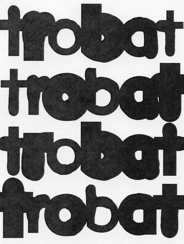
Stacked sans-serif wordmark using heavy hand-cut letterforms with irregular edges and paper texture, repeated four times in alternating dark and light treatment.
Summary
The lowercase word "trobat" set four times in a hand-cut display sans-serif with heavy rounded bowls and rough edges on textured paper, creating a brutalist wordmark through stacked repetition.
Visual description
Four stacked lines of "trobat" fill the frame, each word identical but pressed directly against the next with minimal line spacing. The letterforms are extremely heavy and rounded, with fat bowl shapes and short ascenders that read like cut paper or hand-stamped printing, not a refined typeface. The black ink carries a visible fibrous paper texture throughout, creating slight irregularities and a mottled surface. Set solid black on warm cream ground, there is no secondary color or detail; the contrast and repetitive rhythm are the sole graphic elements.
Key takeaway
The imperfect hand-cut edges and visible paper grain give the wordmark tactile personality without any decoration. Stacking the single word four times creates pattern, rhythm and visual weight from pure repetition and scale. The tightly-spaced lines make the counters and bowl shapes interlock visually.
Reuse notes
Strong for craft brands, music, food labels, or any identity needing anti-slick warmth. The texture must be preserved at large scale on uncoated stock; vectorized or flattened digitally, it loses its core charm. Works best where hand-made imperfection reads as intentional rather than sloppy.
More like this




Keep what you find
A free account saves references to boards and can send you a weekly email of picks based on what you save.
To see every result, go Pro.