Preview image. Unlock full-res
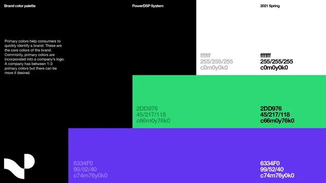
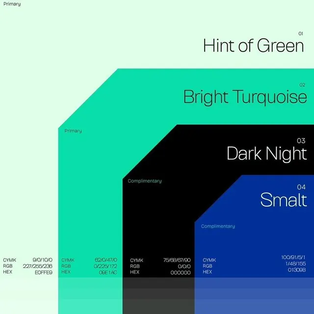
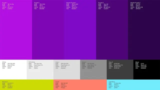
A brand-guideline color sheet laying out a violet-to-black scale plus grey neutrals and three accents, each swatch annotated with its RGB, PMS, CMYK, and HEX values.
Summary
A brand-guideline color page that arranges a five-step violet ramp across the top, a row of six greys from white to black in the middle, and three accents (mustard, coral, light blue) at the bottom, each block labeled with full print and screen color values.
Visual description
A wide three-band grid of full-bleed color blocks. The top band runs five tall violet panels darkening left to right, from a bright magenta-purple to a near-black aubergine, named Purple 1 through Master Purple 2. The middle band steps through six neutral panels: White, Off-White, Grey 1 through Grey 3, and Black. A narrower bottom band holds three saturated accents, a lime-mustard, a coral, and a cyan light blue. Inside each block, small left-aligned type lists RGB, PMS, CMYK, and HEX in a tidy label-and-value column, white text on dark blocks flipping to dark text on light ones.
Key takeaway
The four-value annotation per swatch (RGB, PMS, CMYK, HEX) is the move: it makes one sheet usable for screen, spot, and process printing at once, so no one has to guess a conversion. Organizing by role, a graduated brand ramp, then neutrals, then accents, communicates hierarchy before anyone reads a single number.
Reuse notes
A direct template for the color page of a brand style guide or design-system handoff. Keep the four-value block and the dark-on-light text inversion; both are what make it production-ready rather than decorative. Pairs naturally with adjacent type-spec and logo-usage pages in the same guideline.