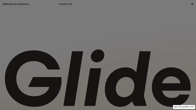
Preview image. Unlock full-res
A 21-slide brand guidelines deck for no-code platform Glide, built on a strict left-label / right-content split, oversized neo-grotesque headlines, and full-color section dividers in teal, coral, and black.
Summary
A 21-slide internal brand guidelines book (Version 3.0) for Glide, the no-code work-app platform. Its character comes from two consistent moves: a rigid two-column grammar where a tiny bold left label sits beside oversized right-hand content, and full-bleed single-color section dividers that swap between black, teal, and coral to pace the document.
Visual description
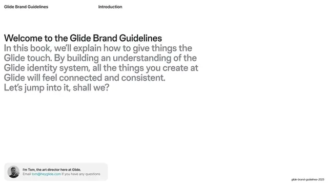
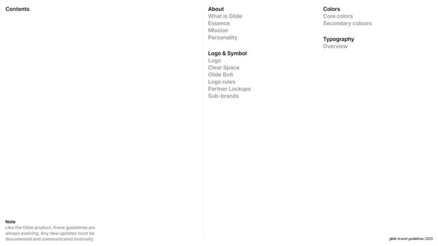
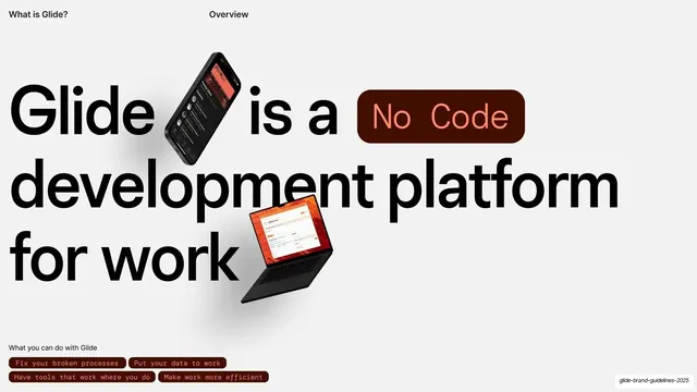
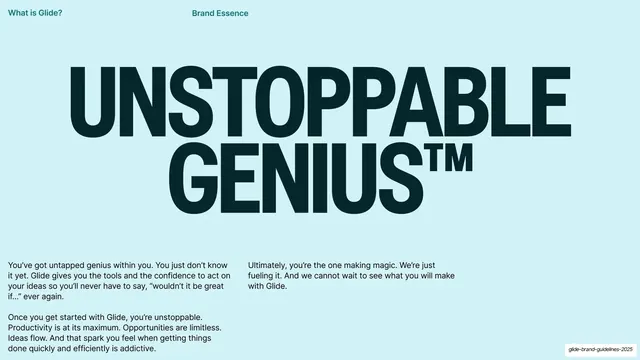
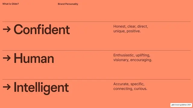
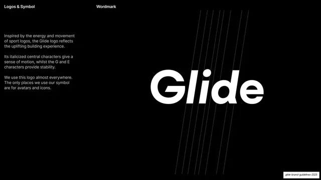
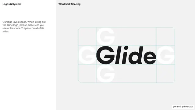
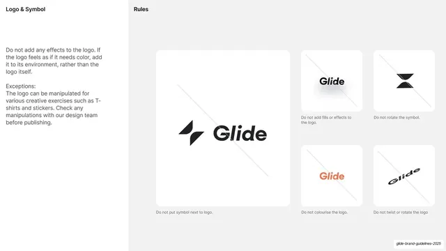
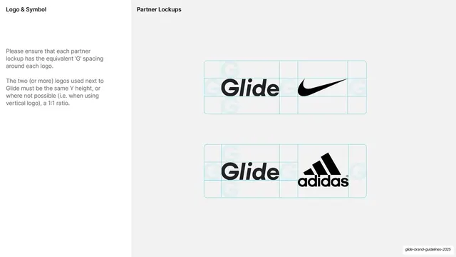
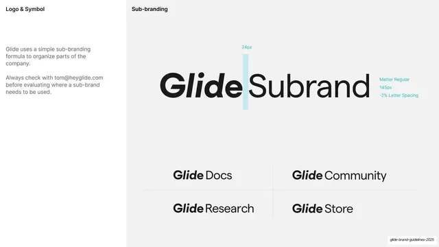
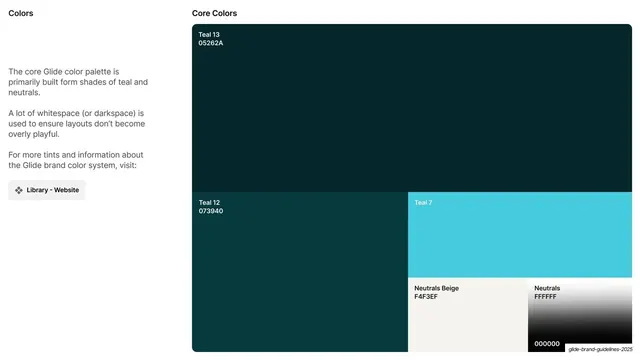
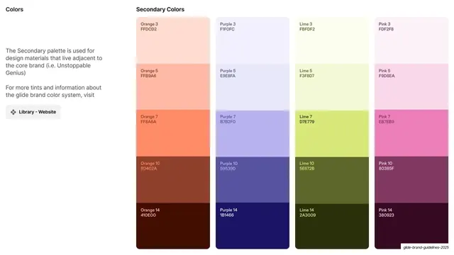
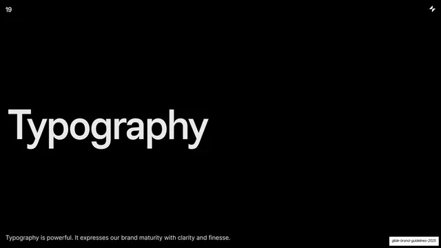
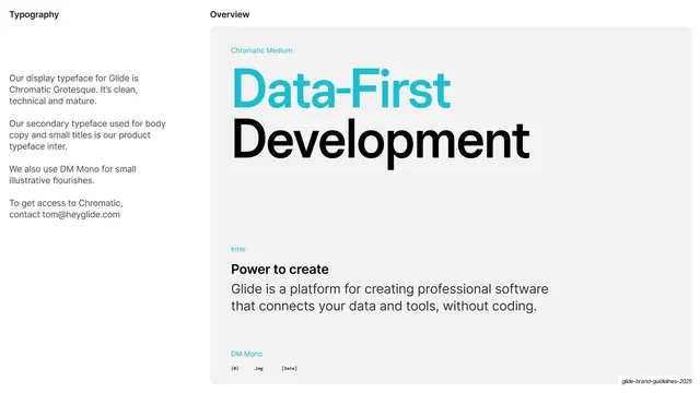
Slides run 16:9. Most content slides use a light grey-white ground (#F4F3EF / #FFFFFF) with a fixed running header in small bold sans: a left descriptor ("Glide Brand Guidelines", "Logos & Symbol", "Colors", "Typography") and a centered section title ("Introduction", "Overview", "Brand Essence"). A small italic black footer slug sits bottom-right on every slide. The type system is a clean neo-grotesque: a tight display cut (Chromatic Grotesque) for huge headlines, a humanist sans (Inter) for body, and DM Mono for small monospace flourishes; the Glide logo is an italicized wordmark whose central "li" leans for motion while the G and e stay upright. Section dividers break the grid: full-bleed black, teal (#05262A), or coral (#FF8A6A) fields with a single oversized lowercase-to-titlecase word ("What is Glide", "Logos & Symbol", "Colors", "Typography") locked to the lower-left, a small page number top-left, and the four-point Glide "bolt" symbol top-right. Recurring content layouts: a narrow left text column (intro paragraphs, an avatar contact card) beside a large right display area; a three-row personality table with arrow-prefixed words and hairline rules; logo construction and clear-space diagrams on light grids with cyan guide lines; a six-cell logo do-not grid of crossed-out misuses; partner lockups (Glide + Nike, Glide + adidas) on G-spacing grids; a bento color grid of named, hex-coded swatches; and a multi-typeface specimen card. The palette pairs deep teals (Teal 13 #05262A through bright Teal 7 #36C5D9) and neutrals with a coral accent and a full secondary ramp of Orange, Purple, Lime, and Pink tints.
Key takeaway
The disciplined left-label / right-content split that makes every spread instantly scannable and keeps a long technical document calm. The single-color section dividers (black, teal, coral) that segment the book with zero decoration, each anchoring one oversized word to the lower-left. And the restraint of letting one neo-grotesque type family plus tiny mono accents carry the whole brand voice.
Reuse notes
A strong reference for any brand guidelines, design-system, or internal handbook deck, especially for SaaS, developer-tool, or productivity brands that want a confident, technical-but-friendly tone. The component grammar is directly reusable: section dividers, logo clear-space and misuse grids, partner-lockup spacing diagrams, sub-branding lockups, and named hex swatch grids. Depends on a genuinely good display grotesque and a distinctive logo to carry the big-type halves; on a generic typeface the empty space reads as thin rather than premium.
From this deck: Glide Brand Guidelines 2025
View deck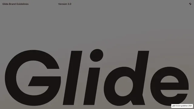


More like this

Keep what you find
A free account saves references to boards and can send you a weekly email of picks based on what you save.
To see every result, go Pro.