Preview image. Unlock full-res
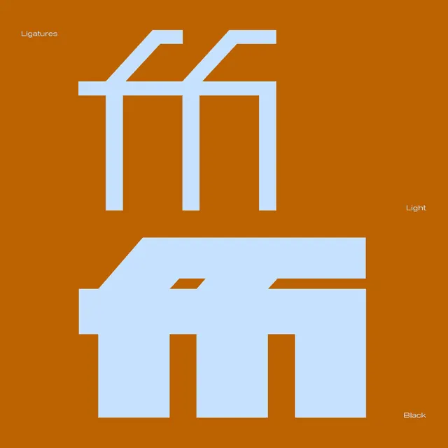
A type specimen poster showing the Kritik ff ligature in pale blue on burnt orange, contrasting a thin Light cut above with a heavy Black cut below.
Summary
A square type specimen on burnt orange that stacks the same "ff" ligature twice in pale icy blue: a thin Light weight up top and a massive Black weight below, the two weights set as a direct comparison.
Visual description
The full bleed is a single warm burnt-orange field. Two oversized renderings of an "ff" ligature dominate, both in a cool pale blue. The upper pair is a hairline geometric construction with squared terminals and sharp right-angle joins, the crossbars merging into one continuous beam. The lower pair is the same letterform at maximum weight, so heavy the stems nearly fuse and the counters shrink to thin slots, reading almost as a solid architectural block. Three small white labels sit in the corners as quiet annotation: "Ligatures" top-left, "Light" mid-right, "Black" bottom-right, marking the comparison. The duotone palette and squared strokes give it a precise, engineered look.
Key takeaway
Showing one glyph at the two extremes of a weight axis on a single page is an efficient way to communicate a typeface's range. Tiny corner labels carry all the explanation while the letterforms do the talking, keeping the layout clean.
Reuse notes
A strong template for type foundry promos, font release announcements, or any specimen that needs to prove range fast. The orange-on-blue duotone is memorable but specific; the layout idea transfers to any two-color pairing. Works best when the chosen glyph has interesting joins worth seeing big.
More like this

Keep what you find
A free account saves references to boards and can send you a weekly email of picks based on what you save.
To see every result, go Pro.