Preview image. Unlock full-res
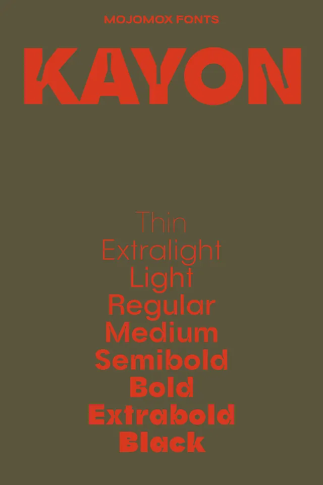
A vertical type specimen for the Kayon family from Mojomox Fonts, showing the name in a huge geometric display cut, then a centered ladder of weights from Thin to Black, all in red on olive.
Summary
A vertical font specimen for KAYON by Mojomox Fonts: a small red foundry label up top, the name set huge in a quirky geometric display cut, then a centered list naming each weight, Thin through Black, rendered in that actual weight so the family ramps up in front of you.
Visual description
Everything is two colors, a single red-orange on a flat olive-brown ground. The foundry credit MOJOMOX FONTS sits centered and small at the very top. Below it KAYON spans nearly edge to edge in a fat geometric display style full of personality: a sharp wedge cut into the A, a perfectly circular O, and chunky terminals. The lower two-thirds is a centered stack of single words, Thin, Extralight, Light, Regular, Medium, Semibold, Bold, Extrabold, Black, each typeset in the weight it names, so the column visibly thickens from a hairline at the top to a heavy slab at the bottom. Generous space separates the hero name from the ladder.
Key takeaway
The self-demonstrating weight ladder, label each weight with its own name set in that weight, so the specimen proves the range instead of just listing it. Also the discipline of a strict two-color palette: one ink on one ground makes a specimen feel like a designed object rather than a glyph dump.
Reuse notes
A clean template for any foundry or designer presenting a single family, the structure (foundry line, oversized name, named weight ramp) ports directly to a new typeface or a brand's chosen font. The duotone keeps it striking but means it leans decorative; for a working spec sheet you would add point sizes, glyph sets, and sample paragraphs.
More like this
Keep what you find
A free account saves references to boards and can send you a weekly email of picks based on what you save.
To see every result, go Pro.