Preview image. Unlock full-res
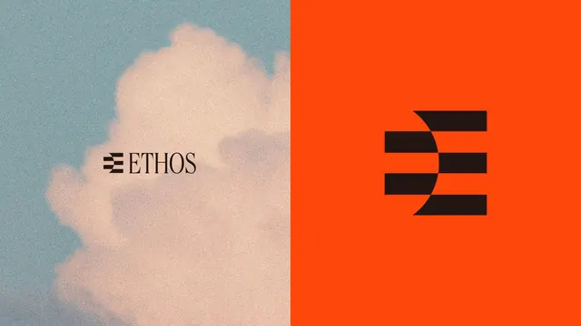
A two-panel brand identity layout pairing a grainy pastel cloud photo carrying the ETHOS serif wordmark with a solid orange-red panel holding the bold black E monogram.
Summary
A two-panel identity board splitting a soft, grainy photograph of a cloud against teal sky on the left from a flat orange-red field on the right, with the brand name set as a serif wordmark and reduced to a bold black monogram.
Visual description
The frame divides in half. The left half is a film-grained photo of a billowing cream cloud over muted teal sky; centered on it is the wordmark, a small horizontal-bar logo glyph followed by "ETHOS" in a classical high-contrast serif. The right half is a saturated orange-red rectangle carrying the same idea as a large black monogram: a stacked, stencil-like "E" built from three horizontal bars whose ends curve, reading as both an E and a forward arrow. The two halves share the black mark but flip context from atmospheric photo to flat brand color.
Key takeaway
Showing the same mark twice, once small and lettered over an atmospheric photo, once huge and abstracted on a flat brand color, to demonstrate range in a single frame. The serif wordmark against a geometric counterform monogram is a deliberate tension worth borrowing.
Reuse notes
A clean way to present a logo system on one slide: real-world warmth on one side, pure brand color and the abstracted mark on the other. The grainy photo softens an otherwise hard geometric mark; keep the grain if you want the identity to feel less corporate. Strong for an agency or culture-led brand.
More like this


Keep what you find
A free account saves references to boards and can send you a weekly email of picks based on what you save.
To see every result, go Pro.