Preview image. Unlock full-res
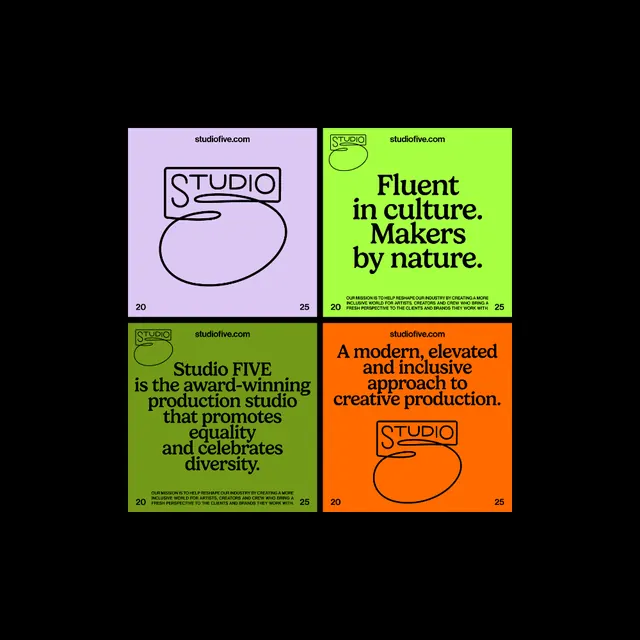
A four-square brand layout for Studio FIVE where a single continuous line draws both the STUDIO box and a looping 5, set in serif type across lavender, lime, olive, and orange panels.
Summary
A 2x2 grid of brand panels for Studio FIVE, unified by one monoline logo that draws a boxed STUDIO label whose tail loops down into a numeral 5. Each panel is a single flat color and pairs the mark with a serif statement.
Visual description
Four equal square panels on black: lavender top-left, lime top-right, olive bottom-left, orange bottom-right. Each panel runs the url studiofive.com top-aligned and a small 20 / 25 in the corners. The logo is a thin black single-stroke line forming a rounded rectangle around STUDIO, then continuing into a large open loop that reads as a 5. Body lines are set in a chunky, slightly condensed serif with tight leading ("Fluent in culture. Makers by nature."), with a small all-caps sans mission line beneath. The lavender panel shows the logo alone; the others lead with the serif statement.
Key takeaway
The continuous-line logo where the wordmark container and the numeral are one unbroken stroke, so the mark works at any panel size. And the system idea: fix the type, url, and year markers, then rotate background color and which line of copy leads, to generate an infinite poster series from three variables.
Reuse notes
A strong template for a small studio or production house that needs a flexible social and poster kit from one logo. The bold serif carries the personality, swap it and the whole tone changes. Works because every panel keeps black type, so any saturated background color drops in cleanly.
More like this




Keep what you find
A free account saves references to boards and can send you a weekly email of picks based on what you save.
To see every result, go Pro.