Preview image. Unlock full-res
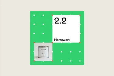
Minimalist product logo pairing a bright lime-green framing square with a white polka-dot grid pattern and a central white callout box for product numbering and name.
Summary
A flat-design logo for an education app, using a bright lime-green square frame with a grid of white polka dots and a centered white rectangle that holds the product version "2.2" and the name "Homework."
Visual description
A single-color-ground composition. A large lime-green square fills most of the frame against a neutral beige background. The green field is punctuated by regularly spaced white circles arranged in a loose grid pattern (approximately 6 rows, evenly spaced). Centered within the green square is a white rectangular inset (approximately a quarter of the frame), containing the numeral "2.2" in large, clean sans-serif weight at the top, with the word "Homework" in smaller caps below. The entire composition is geometrically balanced and highly legible, with generous whitespace within the callout box.
Key takeaway
The polka-dot texture as a lightweight way to add visual interest without clutter to a flat field. The offset white box as a focal container within a solid color, creating hierarchy without additional colors. The numbering-plus-name structure as a product versioning/naming convention. The green color choice as optimistic and educational without feeling juvenile.
Reuse notes
Strong for education apps, learning platforms, or kids' products where simplicity and clarity are paramount. The flat treatment and clean geometry work well in mobile contexts and at small sizes. The polka-dot pattern could feel dated if overused; reserve for brands that want a slightly playful or organized tone. Less suitable for premium or enterprise education products; this reads as friendly and approachable rather than serious.