Preview image. Unlock full-res
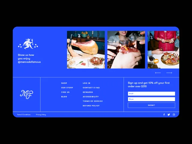
Bright electric-blue footer section for a food brand combining a monogram logo, product photography grid, navigation, and newsletter signup form in white sans-serif typography.
Summary
Bright electric-blue footer section for a food brand combining a monogram logo, product photography grid, navigation, and newsletter signup form in white sans-serif typography.
Visual description
A fully contained footer module with a rounded-corner frame. The background is vibrant electric blue. Left side features the "MJP" monogram in large white serif/script letterforms. A 3-column grid of product photography (bread, hands preparing food, pizza, more food items) sits in the upper right, each image framed as a small rectangle with white borders. Center and right sections contain multiple stacked navigation link lists in small white caps (Shop, Our Story, Contact, Terms of Service, etc). A standalone section on the far right emphasizes "Sign up and get 10% off your first order over £25" with a white text input field and "Submit" button beneath. Social media icons (Facebook, Instagram, Twitter) are aligned bottom right.
Key takeaway
The grid of unlinked product photography establishes brand identity and appetite appeal without requiring interaction. The compact footer density is manageable because the electric blue background provides strong visual containment and the consistent sans-serif typography prevents chaos. The isolated signup call-out uses position and color to stand out from navigation without competing for dominance.
Reuse notes
Effective for food and beverage ecommerce brands where product photography adds immediate value. The electric blue is bold and works best on light or dark backdrops. The rounded-corner container strategy keeps the footer visually discrete. Scale well for responsive layouts by stacking sections vertically. The grid approach would need adaptation if photography quality varies widely.