Preview image. Unlock full-res
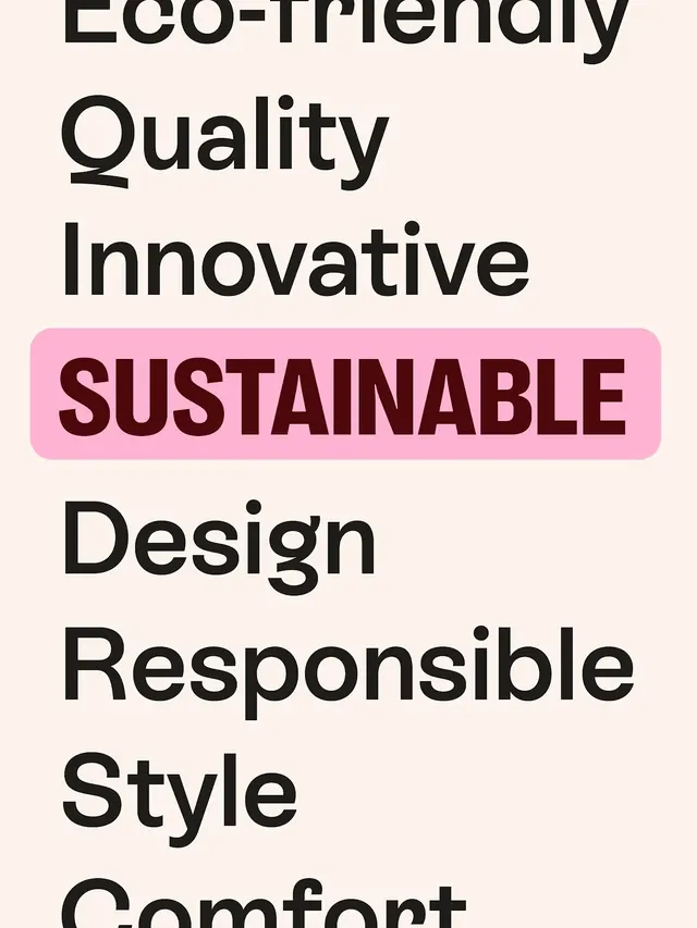
Vertical stacking of sans-serif product attributes with a single hot-pink highlight strip anchoring the core sustainability claim.
Summary
A type specimen presenting eco-brand values through oversized sans-serif words in vertical sequence, with "Sustainable" isolated and emphasized in a hot-pink rounded box.
Visual description
Cream off-white background holds a tall stack of single words in black display sans-serif: "Eco-Friendly", "Quality", "Innovative". The fourth item, "Sustainable", breaks rank and sits in a hot-pink rounded rectangle with dark burgundy text in a bolder weight. Below continue "Design", "Responsible", "Style", "Comfort" in the original black sans-serif, all left-aligned. The type contrast is extreme: each word is letter-spaced and scaled for impact, with deep negative space between lines emphasizing hierarchy and deliberate composition. No imagery, no ornament.
Key takeaway
The technique of isolating a single value claim inside a color-blocked box to create visual hierarchy and intentional emphasis. The restraint of using only two colors and two type weights to prevent noise while maintaining clear focal hierarchy.
Reuse notes
Effective for sustainability-focused or values-led consumer brands. Works best when the highlighted claim is the core differentiator. The minimal palette and vertical stacking keep it legible on social media and small screens. Pair with product photography or photography only; the type alone carries the narrative weight.
More like this


Keep what you find
A free account saves references to boards and can send you a weekly email of picks based on what you save.
To see every result, go Pro.