Preview image. Unlock full-res
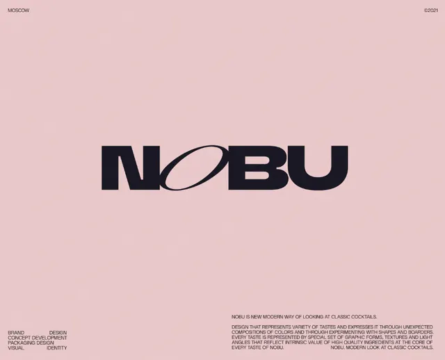
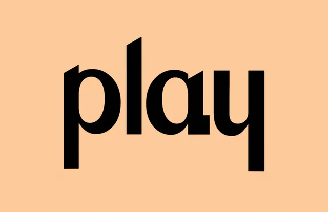
Bold geometric sans-serif wordmark with an integrated curved accent, centered on a warm pink background with minimal supporting text.
Summary
A bold geometric sans-serif wordmark with a curved oval accent mark positioned within the letterforms, printed centered on a soft warm-pink background with minimal supporting typographic elements.
Visual description
The wordmark "NOBU" is set in a heavy, geometric sans-serif with sharply squared letterforms. A thin curved oval accent floats inside the "O," creating visual rhythm and breaking the rigidity of the geometry. The letterforms are black against a warm dusty-pink background. Small text appears in the bottom corners (gray, likely legal or informational content) and at the top-right corner (in the same warm-pink tone). The overall layout is perfectly centered, relying on negative space and the contrast between the bold black type and soft warm background.
Key takeaway
The use of a thin curved accent within a geometric wordmark to add sophistication and visual interest without losing legibility; the pairing of heavy sans-serif with an elegant curved element. The warm-pink background choice conveys luxury and refinement while remaining muted enough not to overpower the wordmark. The minimal use of supporting text to maintain focus on the primary mark.
Reuse notes
Ideal for hospitality, luxury goods, fashion, or food-and-beverage brands seeking an elegant, modern identity. The pink tone works especially well in beauty, lifestyle, and upscale dining contexts. The geometric + curved contrast is versatile and scalable across applications. Works across digital and print without loss of impact.
More like this

Keep what you find
A free account saves references to boards and can send you a weekly email of picks based on what you save.
To see every result, go Pro.