Preview image. Unlock full-res
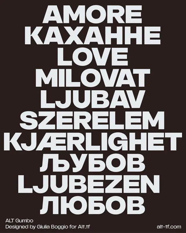
Multilingual type specimen in all-caps geometric sans-serif stacked vertically on dark background, demonstrating character support across Latin, Cyrillic, and other scripts.
Summary
Multilingual type specimen in bold geometric sans-serif, stacked vertically in white on dark background, showcasing Latin, Cyrillic, and other character sets in all-caps.
Visual description
The composition uses vertical stacking of words in different scripts and languages (Amore, Kaxahhe, Love, Milovat, Ljubav, Szerelem, Kjarlighet, Lubov, Ljubezen, Liubov), all rendered in a heavy-weight, geometric sans-serif in white uppercase against a dark charcoal background. The typeface maintains consistent proportions and weight across all character sets, demonstrating strong unicode support. No imagery, no decorative elements, no hierarchy of size. Designer credit and foundry name appear in small type at the bottom left. The layout is centered and tightly aligned, creating a rhythmic, almost poetic vertical reading.
Key takeaway
The direct, graphic approach to type specimen design: proving character support and multilingual capability through repeated vocabulary across scripts, all in bold weight, no hierarchy, no distractions. The high contrast and geometric forms make each language equally readable and visually compelling.
Reuse notes
Use as a reference for demonstrating global character-set coverage and typeface versatility across writing systems. Effective for foundry portfolios and typeface marketing where script diversity is a selling point. The all-caps, bold treatment limits use to display/headline contexts.
More like this




Keep what you find
A free account saves references to boards and can send you a weekly email of picks based on what you save.
To see every result, go Pro.