Preview image. Unlock full-res
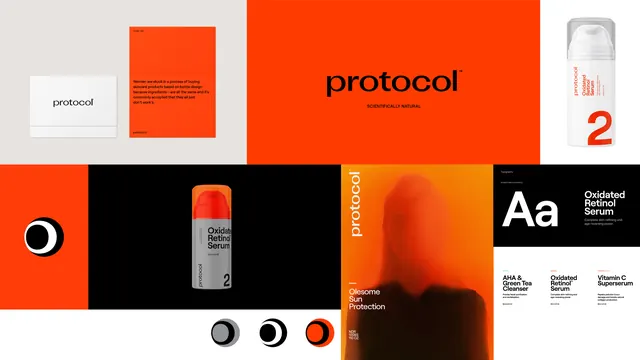
Multi-panel brand identity presentation for "protocol" skincare line featuring bold orange, black and white color blocks, logo variations, product bottle mockups, and typography specimens.
Summary
A comprehensive brand identity collage for a skincare brand "protocol" using high-contrast orange, black, and white with clean sans-serif typography and product photography.
Visual description
The layout is a grid of panels: white business card with black logo, orange card with body text, large orange panel with "protocol" wordmark and tagline, white bottle mockup with orange "2", circular black and orange logo mark, product bottle on black, orange-tinted silhouette image, typography specimen sheet. The logo is a simple wordmark and a circular symbol. All elements use consistent geometric sans, generous spacing, and the limited palette.
Key takeaway
Restricting to three high-impact colors and strict typographic hierarchy to create a cohesive, memorable, and scalable identity system across print and packaging.
Reuse notes
Strong reference for beauty and wellness brand systems. The bold color blocking and minimal logo work well for packaging, digital, and print collateral.
More like this






Keep what you find
A free account saves references to boards and can send you a weekly email of picks based on what you save.
To see every result, go Pro.