Preview image. Unlock full-res
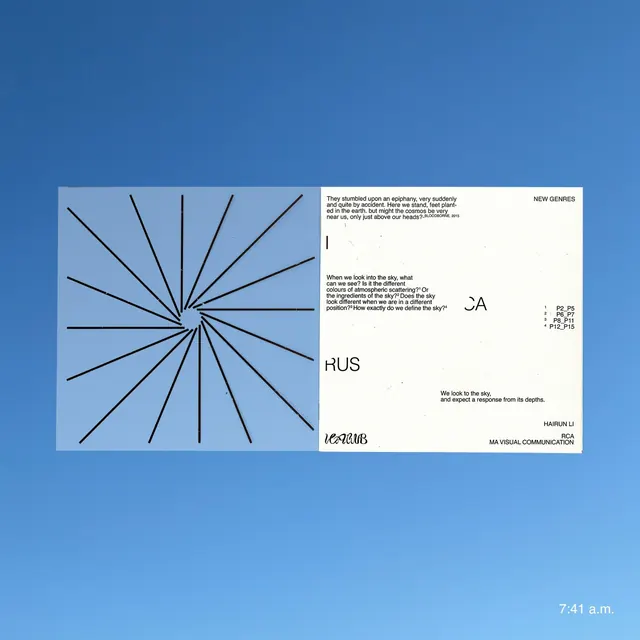
Pale blue background with radial line diagram emanating from center point, paired with modular typographic blocks and wayfinding information.
Summary
A brand identity system for HUS combining a radial spoke diagram with modular typographic blocks, information layout, and logotype.
Visual description
Pale blue background. On the left, a geometric diagram of thin black lines radiating from a central point, suggesting a wheel, network, or directional system. On the right, three stacked information blocks in white: upper block contains justified body copy with "NEW SEMIES" label and code listing; middle block has the logotype "HUS" in bold sans-serif; lower block includes text blocks and organizational details. The layout balances the geometric left element with the typographic-information right, creating a structured, institutional feel.
Key takeaway
The use of a simple radial diagram as a primary identity element that can carry multiple semantic meanings (network, direction, inclusivity, growth). The system's modular right panel allows flexible typographic content while maintaining visual coherence through generous whitespace and aligned grid. The cool blue-and-white palette and single sans-serif typeface suggest calm authority.
Reuse notes
Strong for institutional brands, healthcare systems, NGOs, or research organizations needing both visual strength and information hierarchy. The radial mark is simple enough to scale to a favicon or seal, while the modular right side accommodates variable content. Relies on adequate whitespace to read cleanly.
More like this


Keep what you find
A free account saves references to boards and can send you a weekly email of picks based on what you save.
To see every result, go Pro.