Preview image. Unlock full-res
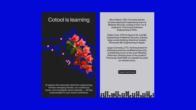
Vibrant blue split-screen layout with illustrated red flowers and team bios for a security software case study.
Summary
Split-screen case study layout with illustrated red flowers on a vibrant blue left panel and team bios on a light gray right panel for a security-focused AI tool.
Visual description
A bright, saturated cobalt-blue background fills the entire composition. On the left, large illustrated red and coral flowers with green foliage emerge from a cluster of small blue circles and dots, creating movement and organic warmth against the hard tech color. Text "Cotool is learning" sits above the flora in white sans-serif. On the right, a light gray panel shows three team member bios with their titles and prior experience. A single black button labeled "Explore benchmark" sits below the text. At the bottom of the right panel, a row of small circular avatars in dark tones. The clean sans-serif type throughout maintains professional authority while the flower illustration softens the tech industry framing.
Key takeaway
Pairing a vibrant technical color (cobalt blue) with organic illustration (bold red flowers) lowers the intimidation factor of security/engineering messaging. The split-screen asymmetry (illustration vs. text) holds visual tension without chaos. Small circular avatars at the base subtly reinforce team-scale and human presence.
Reuse notes
Strong for AI, security, or engineering companies that want to claim both rigor and approachability. The blue-red-flower language is distinctive; less effective if trying to blend into category norms. Works in case-study pages, marketing decks, and product trust narratives. The team bio format suits founder/leadership spotlighting.