Preview image. Unlock full-res
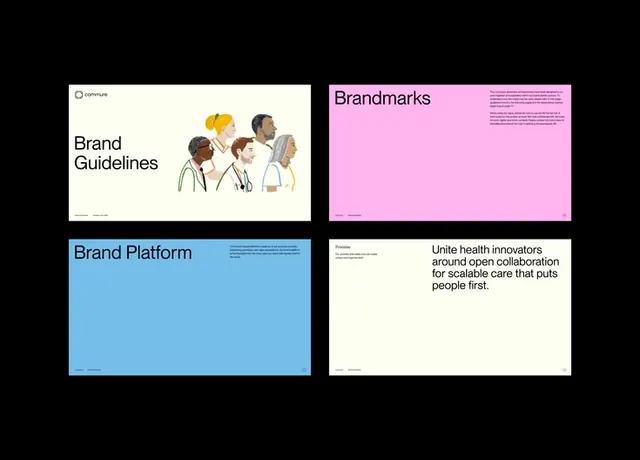
Four-page brand guideline spread showing visual system hierarchy with illustrated healthcare workers, color-coded sections, and open mission statement.
Summary
A four-panel brand guideline system using color-coded pages, illustrated healthcare workers, and ample whitespace to establish visual hierarchy and voice for a health-tech platform.
Visual description
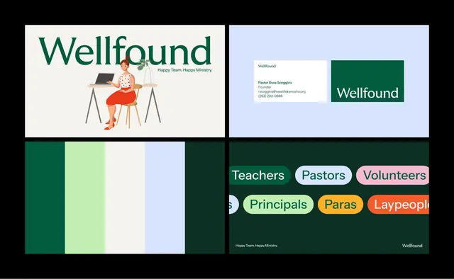
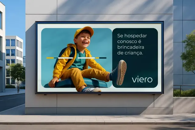
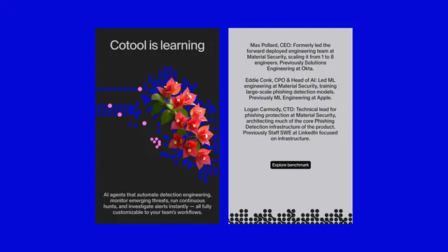
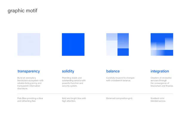
A 2x2 grid of guideline spreads displayed as flat mockups. Top-left (cream background): "Brand Guidelines" header above illustrations of four diverse healthcare professionals rendered in a soft, minimalist style with muted skin tones and warm yellow accents. Top-right (hot magenta background): "Brandmarks" heading with small black body text detailing mark usage rules. Bottom-left (bright cyan-blue background): "Brand Platform" header with supporting copy and logo treatments. Bottom-right (cream background): Mission statement reading "Unite health innovators around open collaboration for scalable care that puts people first." in a geometric sans-serif, left-aligned. Each panel is separated by white gutters. The overall layout feels modular and repeatable.
Key takeaway
The color-blocking per section (each guideline page gets its own chromatic anchor) makes dense rule sets scannable and memorable without visual chaos. The healthcare illustration style balances professional credibility with human warmth. The sparse typography hierarchy (header + body in a single sans-serif family) shows that guidelines can be reduced and still feel complete. Cream margins between sections act as breathing room and reinforce system modularity.
Reuse notes
Excellent template for healthcare, nonprofit, and mission-driven brands. The illustration approach softens corporate rigidity and signals inclusivity. Works at any scale because of strong color separation. The muted illustration palette pairs naturally with vibrant brand colors (magenta, cyan) without competing. Use this structure for decks, printed guidelines, or onboarding documentation.