Preview image. Unlock full-res
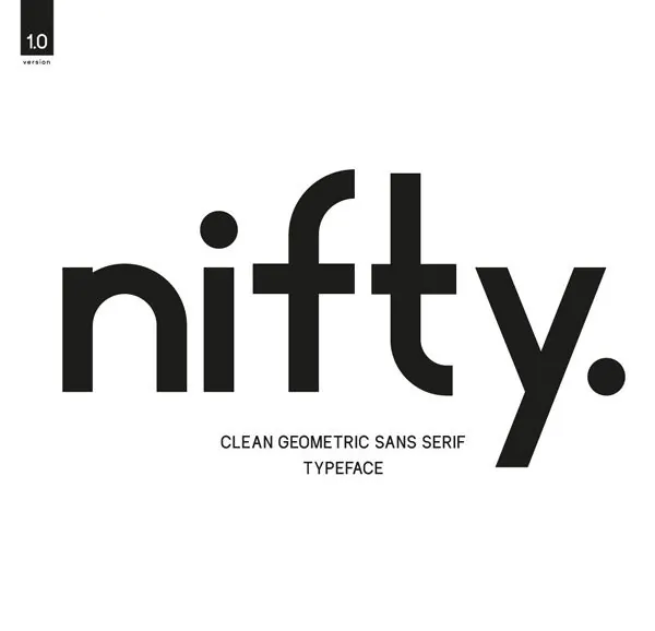
Bold, wide-spaced geometric sans-serif wordmark for Nifty with uniform stroke weight and sharp letterforms on white.
Summary
Bold, geometric sans-serif wordmark with uniform stroke width and evenly spaced letters, centered on white with a small version stamp in the upper left corner.
Visual description
The word "nifty" is set in a wide-fit, geometric sans-serif with consistent stroke weight throughout. Each letterform is constructed from clean, angular strokes with minimal curves. The "i" dot and "y" tail end in small circles, reinforcing the geometric system. The composition centers the wordmark on a white ground, with a copyright symbol and "10" / "version" label positioned in the upper left as a stamp identifier. Strong two-color contrast between black letterforms and white negative space.
Key takeaway
The uniform stroke weight creates confident, memorable letterforms without ornamentation. The small geometric terminals (dot and tail circles) unify the letterface personality. The version stamp placement signals polish without cluttering the mark.
Reuse notes
Ideal for tech, fintech, or startup identities where geometric cleanliness signals innovation. Works well at small scales due to high contrast and clear letterforms. The consistent spacing rewards wider-set type and benefits from generous breathing room.
More like this



Keep what you find
A free account saves references to boards and can send you a weekly email of picks based on what you save.
To see every result, go Pro.