Preview image. Unlock full-res
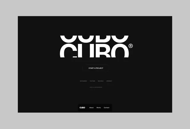
A minimalist agency homepage featuring a large curved letterform wordmark in white on a solid black background, with a single call-to-action button and footer navigation.
Summary
A minimalist agency homepage featuring a large curved letterform wordmark in white on a solid black background, with a single call-to-action button and footer navigation.
Visual description
A centered black rectangle occupies the canvas. In the upper-center zone, the wordmark "CUBO" in white, all-caps sans-serif displays at large scale, with the curved letterforms creating an organic, almost sculptural quality against the void. Below the mark sits a single dark-outlined button reading "START A PROJECT" in small caps. The lower third contains a minimalist footer: social media links (INSTAGRAM, YOUTUBE, BEHANCE, DRIBBBLE) in light gray, a copyright notice, and the brand name "CUBO" plus navigation links (About, Works, Contact) in footer-gray weight. Every element is center-aligned; negative space dominates, ensuring the wordmark reads with absolute clarity.
Key takeaway
The generous negative space around the single wordmark creates immediate prestige and focus. A single button centered beneath the mark establishes hierarchy without clutter. The footer, while functional, stays typographically minimal and does not distract. This layout pattern scales to any wordmark and portfolio context.
Reuse notes
Perfect for creative agencies, design studios, or portfolio sites where the work itself takes center stage. The black-background approach works exceptionally well when the site transitions to project case studies. The wordmark-as-hero approach suits tech, consulting, or luxury brands where clarity and simplicity signal confidence. Easy to adapt to dark or light color schemes; the principle is the same.
More like this




Keep what you find
A free account saves references to boards and can send you a weekly email of picks based on what you save.
To see every result, go Pro.