Preview image. Unlock full-res
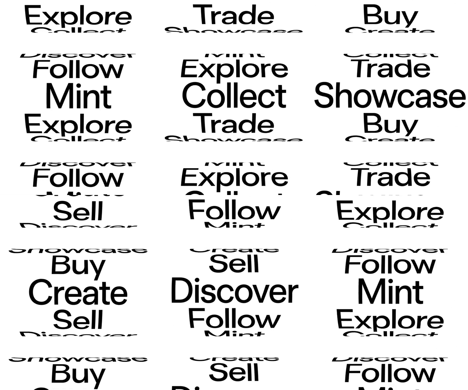
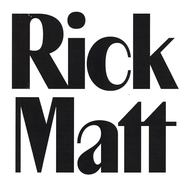
Monochromatic type specimen layering bold sans-serif phrases vertically with repeating strikethrough lines creating a rhythmic, intentional composition.
Summary
Monochromatic type specimen stacking bold sans-serif phrases vertically with intersecting strikethrough lines, creating visual rhythm through repetition and textual layering.
Visual description
Bold sans-serif words and phrases stack vertically on white, with scale variation across lines for hierarchy. Horizontal strikethrough lines—some full-width, some partial—layer atop and between the text, creating a secondary visual grid that adds conceptual tension and rhythm. The composition is centered and uses consistent letterforms in pure black against white, with no color variation. The strikethroughs suggest cancellation, rejection, or deliberate obscuring while the readable text remains clear, creating a dynamic visual conversation between presence and erasure.
Key takeaway
Using strikethrough as a compositional device rather than a functional mark, creating visual rhythm through repetition at varying scales, layering text and lines to build hierarchy and visual interest without color, the tension created by readable text crossed with intentional marks.
Reuse notes
Strong for bold, conceptual branding or editorial design that wants to convey intentionality and thought. Works well in monochromatic contexts where tone-of-voice matters as much as legibility. Pairs well with minimal, contemporary aesthetics. Use caution if audience legibility is paramount; the strikethroughs and stacking can obscure meaning for accessibility-first contexts.
More like this





Keep what you find
A free account saves references to boards and can send you a weekly email of picks based on what you save.
To see every result, go Pro.