Preview image. Unlock full-res
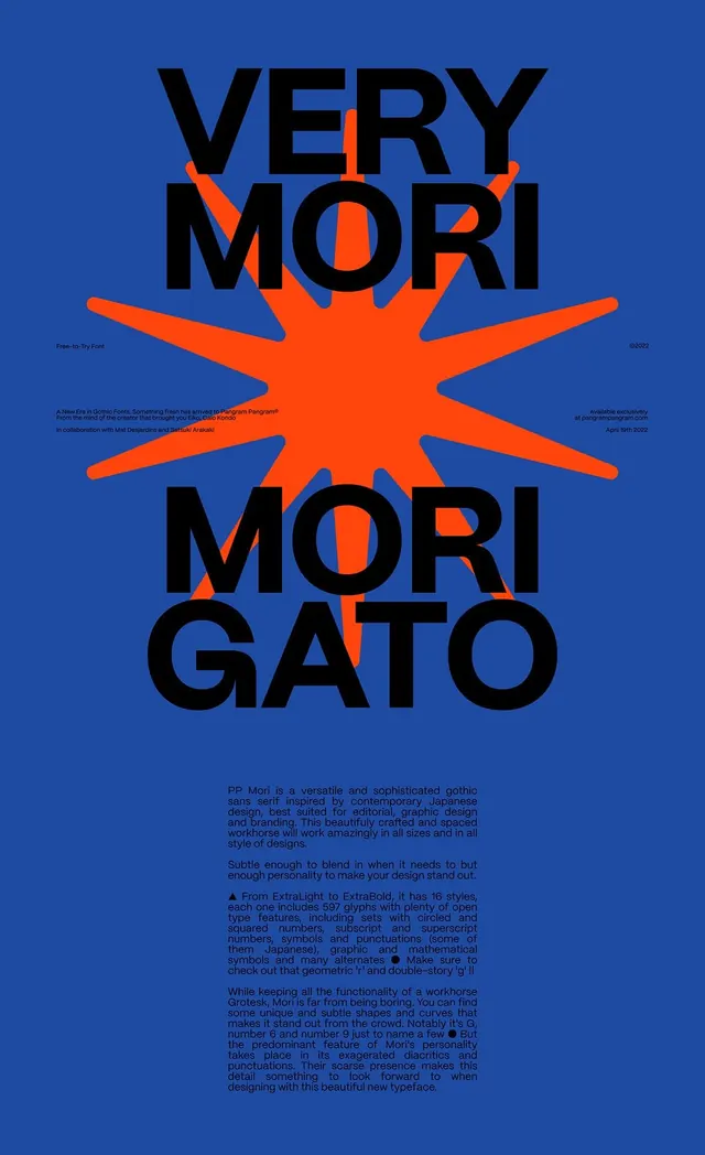
High-contrast poster typography specimen for a gothic sans featuring an oversized orange starburst graphic centered on deep blue, with black display type layered atop and justified body copy below.
Summary
Poster-style typography specimen for the PP Mori gothic sans featuring a large centered orange starburst radiating behind black display type stacked vertically on a deep blue ground.
Visual description
A vertical poster composition with a dominant geometric focal point. A large orange starburst with pointed rays radiates from the center, creating a dramatic angular burst. Black sans-serif type reading "VERY MORI MORI GATO" is stacked in three lines and positioned to overlap the starburst, with characters partially occluded by the orange rays. The starburst's jagged points extend to near-canvas edges. Deep royal blue fills the entire background. Below the type burst, justified body text in black describes the typeface in detail, explaining its gothic origin, weight range, and distinctive features (diacritics, geometric forms, curved letterforms). Small metadata text anchors the top corners (font name, copyright information). No intermediate colors; only pure blue, orange, black, white.
Key takeaway
The starburst as a structural device that activates the entire composition and breaks type into reading zones without a rigid grid. Layering black type over a saturated orange shape creates legibility and visual punch simultaneously. Centering everything (type, geometry, text) on a blue field creates symmetry without feeling static. The font specimen body copy justified to an invisible column adds editorial gravitas and clarifies the font's characteristics through real-world setting.
Reuse notes
Works for bold poster campaigns, music/cultural branding, or editorial covers where drama and symmetry serve the narrative. The all-caps, stacked treatment limits use to headlines and short declarations. The color contrast is extreme; tone down for more refined contexts or when fine detail matters (body copy at small scale will disappear on orange). Starburst geometry reads as energetic and playful, making it best suited to creative, design-forward, or youth-oriented brands.
More like this

Keep what you find
A free account saves references to boards and can send you a weekly email of picks based on what you save.
To see every result, go Pro.