Preview image. Unlock full-res
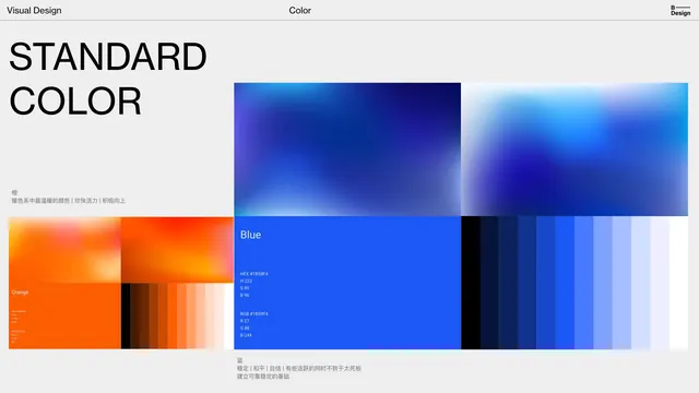
A design documentation page showing standard color definitions for a blue and orange palette, with gradient ramps, hex and RGB values, and multilingual labels.
Summary
A design system documentation page presenting two primary colors (blue and orange) with their corresponding gradient ramps, technical specifications (hex, RGB, HSL values), and labels in English and Chinese.
Visual description
The page is laid out in three columns: a left column with "Visual Design" and "Color" headings and language notes; a center column with two large gradient studies (one showing orange ramps from saturated to near-white tints, one showing blue ramps from dark to light); and a right column containing swatches of discrete color steps in the blue and orange families, labeled with hex and RGB values. The background is off-white or light gray, creating high contrast with the vibrant blue and orange swatches. Text is set in a clean sans-serif for the headings and a monospace font for the technical values. The overall treatment is systematic and professional.
Key takeaway
The two-part ramp structure (gradients on the left for organic transitions, discrete swatches on the right for exact values) provides both intuitive understanding and precise reference; the use of monospace font for technical specifications reinforces the "system" nature of the documentation; the complementary color pair (blue and orange) demonstrates a full color story without clutter.
Reuse notes
Ideal as a reference for building your own color system documentation. The layout works well for design team handoff, developer specs, or brand guidelines. The use of both gradient and discrete steps handles both design-tool and code-implementation needs. Works best when the color story is kept to two complementary or analogous pairs.
More like this





Keep what you find
A free account saves references to boards and can send you a weekly email of picks based on what you save.
To see every result, go Pro.