Preview image. Unlock full-res
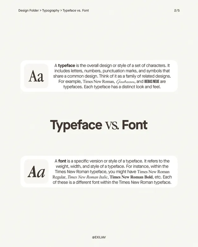
Educational comparison of typeface and font definitions using side-by-side anatomy examples with minimal layout.
Summary
Educational comparison defining typeface versus font using anatomy diagrams and minimal negative space, presented as a reference guide.
Visual description
Page 2 of a 5-page educational sequence. Beige background. Large "Aa" specimen at left in a rounded card container. Main headline "Typeface vs. Font" in heavy black sans-serif sits center-page. Two definition blocks arranged vertically, each with a rounded card icon and body text. Typeface explanation describes a family of related designs (Times New Roman, Garamond, Bebas Neue examples shown in italic and bold variants). Font explanation defines it as a specific weight/width (Regular, Italic, Bold shown as variants within Times New Roman). All text in clean, warm-gray sans-serif; strong use of white space separates sections. Bottom-right credit: "@EXILIAV".
Key takeaway
The split-card layout with matching icon scales that reinforce the hierarchy. The contrast between the two concepts works because each uses identical visual structure but different content. Simple typography pair (display heavy for hierarchy, body sans-serif for definition) with no decoration.
Reuse notes
Ideal for typographic pedagogy, design onboarding materials, or brand guidelines explaining type system hierarchy. Works well in longer sequences where one page is a definition reference.
More like this





Keep what you find
A free account saves references to boards and can send you a weekly email of picks based on what you save.
To see every result, go Pro.