Preview image. Unlock full-res
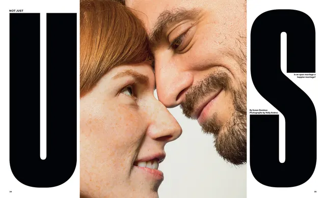
Editorial layout with "NOT JUST" serif typography flanking an intimate couple portrait, centered for a marriage/wedding campaign.
Summary
An editorial layout combining large black serif typography reading "NOT JUST" (with a decorative "U" frame on the right) flanking an intimate close-up photograph of a couple, their faces close together in profile.
Visual description
On the left, white serif typography reads "NOT JUST" in a bold, elegant sans-serif at top. On the left side below is a large rounded serif letter form ("U" shape). The center features a warm-toned, high-detail portrait photograph of a man and woman with their faces close together, captured in profile against a neutral background. On the right side is another large rounded serif letter (decorative "U"), with small body text at bottom. The composition balances typographic weight on left and right with the intimate portrait as the focal center.
Key takeaway
The interplay between bold serif framing and a vulnerable, intimate portrait creates emotional impact. The repetition of large letterforms creates architectural balance while the portrait remains the human anchor.
Reuse notes
Excellent for editorial campaigns, marriage/relationship narratives, or lifestyle branding that needs to balance bold typography with intimate imagery. The black-and-warm-tone palette conveys sophistication and warmth simultaneously.
More like this

Keep what you find
A free account saves references to boards and can send you a weekly email of picks based on what you save.
To see every result, go Pro.