Preview image. Unlock full-res
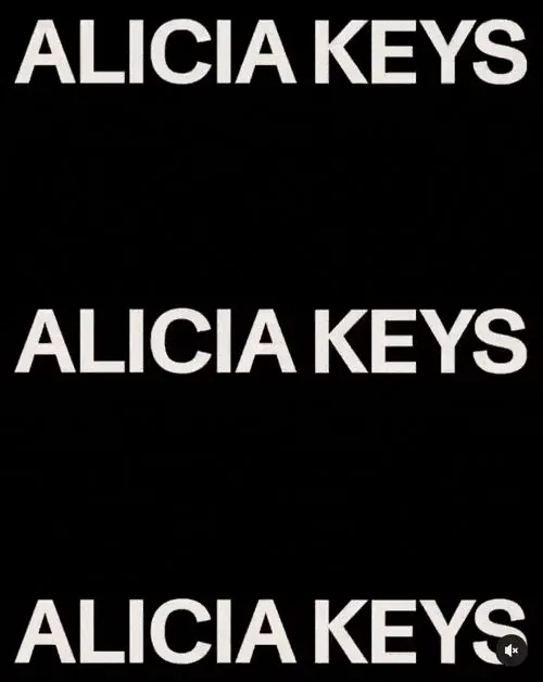
Typographic branding system for Alicia Keys featuring the name repeated three times in bold white sans-serif caps against pure black background.
Summary
Typographic identity system for artist Alicia Keys showing the name set three times in bold white all-caps sans-serif on solid black for maximum contrast and visual rhythm.
Visual description
Three identical instances of "ALICIA KEYS" in bold, geometric sans-serif capitals rendered in off-white/cream (#ECE7E2 equivalent). Each instance spans the full width, positioned at top, center, and bottom with equal vertical spacing. Pure black (#000000) background fills all space between and around type, creating stark graphic separation. The repetition emphasizes the typography itself as the primary visual system. No additional imagery or decorative elements.
Key takeaway
The power of pure typographic repetition and symmetrical spacing to create a bold, recognizable system; the discipline of not adding decorative layers when contrast and scale alone convey impact; the use of negative space as an active design element rather than passive background.
Reuse notes
Ideal for artist/musician branding or entertainment-sector identity where the name itself is the most valuable asset. The stark monochrome works across print, digital, and environmental scales. Pairs effectively with single-color palettes or photography with selective color. Requires confident typography and generous spacing to succeed; cramped or lower-impact typefaces will weaken the system.