Preview image. Unlock full-res
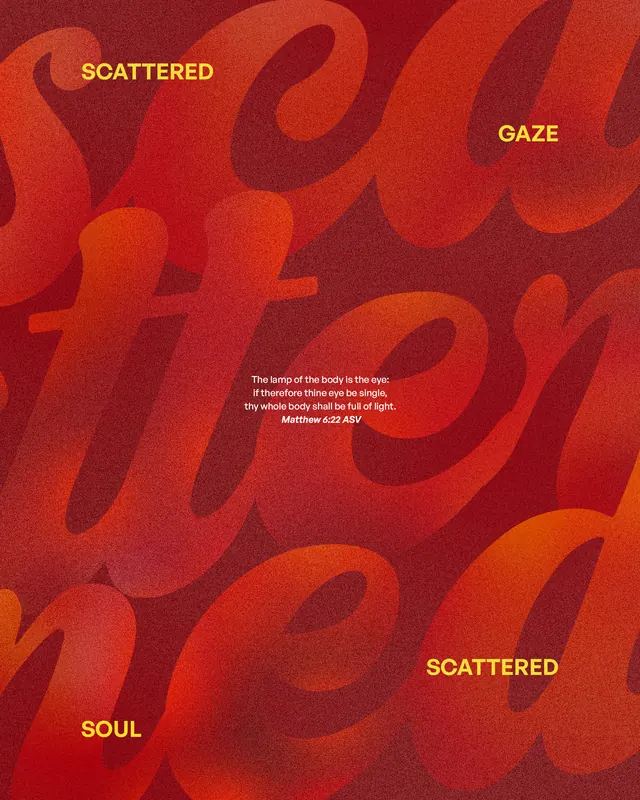
A typographic composition featuring large, densely layered sans-serif letterforms in warm red and burnt orange with yellow text accents and a centered biblical quote.
Summary
A typographic poster layering large overlapping sans-serif letterforms in warm red and orange tones, with golden text labels and a white biblical quote centered in the composition.
Visual description
The composition is dominated by massive, slightly blurred letterforms that overlap and recede into the background, creating a moiree or texture effect through layering. The color shifts gradually from dark burgundy at the top and edges to bright burnt orange in the center, with hints of red-brown throughout. Four small golden-yellow words appear scattered across the field: "SCATTERED" (top left and bottom), "GAZE" (top right), and "SOUL" (bottom left), each approximately 20-24px in weight. At the center sits a compact white sans-serif text block containing a biblical passage: "The lamp of the body is the eye: if therefore thine eye be single, thy whole body shall be full of light. Matthew 6:22 ASV". The overall effect is meditative and introspective, treating typography as texture rather than discrete letterforms. No photographic imagery, no additional color, no ornamentation beyond the interplay of type and gradient.
Key takeaway
Layering typography at various weights and blur levels creates visual depth without illustration. The scatter of small golden callouts ("SCATTERED GAZE SOUL") operates like conceptual anchors or visual markers across the field, echoing the concept of the text. Positioning a sacred or introspective quote at the exact center creates compositional weight and draws the viewer's eye naturally. The warm monochromatic palette (all red and orange family) creates intensity without jarring contrast.
Reuse notes
Excellent for religious, spiritual, or introspective editorial work (devotionals, poetry, meditation guides, faith-based branding). The typographic approach works for posters, book covers, or wall installation. Keep the quote legible enough to read (white on warm color provides adequate contrast). The overlapping letterform technique pairs well with slower-reading, contemplative content rather than marketing or calls-to-action.
More like this

Keep what you find
A free account saves references to boards and can send you a weekly email of picks based on what you save.
To see every result, go Pro.