Preview image. Unlock full-res
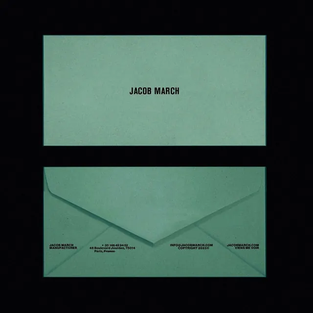
A stationery system showing a sage-green envelope and matching letterhead bearing the name 'Jacob March' in bold sans-serif, with manufacturer details and website in small type.
Summary
A two-piece stationery set for Jacob March (a Paris-based manufacturer) rendered in muted sage green and black sans-serif, featuring a full envelope and matching business card on solid color fields.
Visual description
Two items shown against a black background. Top: a rectangular card bearing "JACOB MARCH" centered in bold sans-serif on a muted sage-green ground. Bottom: an envelope in the same sage green displaying brand details in fine print: "JACOB MARCH MANUFACTURER" on the left, address "48 Boulevard Jourdan, 75014, Paris, France" center-left, "INFO@JACOBMARCH.COM" center-right, and "JACOBMARCH.COM VIENS ME VOIR" on the right. All text is uppercase sans-serif in near-black, meticulously left, center, and right-aligned to create a balanced, formal composition. The envelope flap is folded open, revealing a triangular cutout that adds subtle dimensional interest.
Key takeaway
Monochromatic color treatment with one accent hue reads as deeply sophisticated. Distributing contact details across a landscape layout maximizes legibility without crowding. The open envelope flap is a small functional detail that elevates a standard format into a memorable asset.
Reuse notes
Strong reference for high-end design studios, luxury manufacturers, or agencies targeting European markets. The muted sage palette conveys craftsmanship and restraint, avoiding loud branding tactics. Paris-based positioning and French tag ("viens me voir") are specific to this brand; adapt the manufacturing details and contact info as needed. Excellent template for professional B2B identity systems.
More like this




Keep what you find
A free account saves references to boards and can send you a weekly email of picks based on what you save.
To see every result, go Pro.