Preview image. Unlock full-res
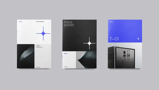
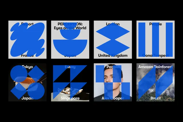
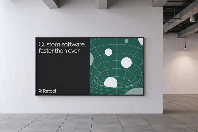
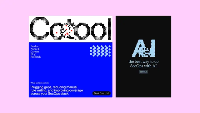
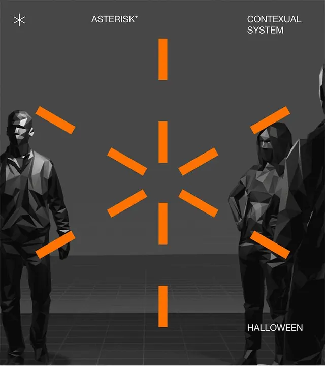
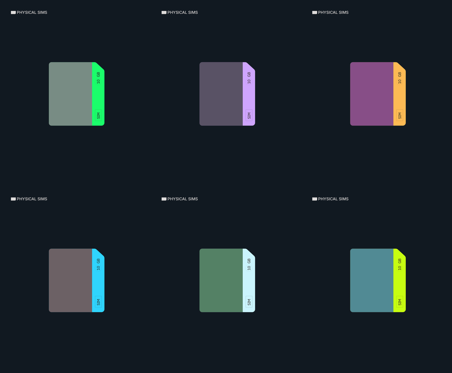
Minimal tech identity system using a dark-mode palette with bright cyan accents for high contrast and functional clarity.
Summary
A minimalist hardware brand identity using a dark color palette with a bright cyan accent for visual focus and functional hierarchy.
Visual description
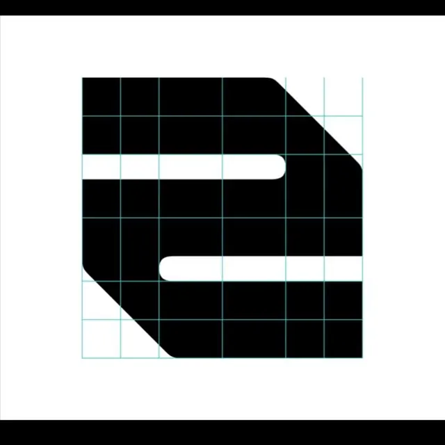
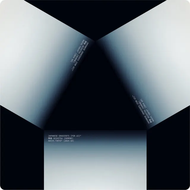
Clean geometric forms presented in high-contrast black, dark gray, and white tones, with bright cyan serving as a strategic highlight color. The design language is functional and modern, using flat shapes and precise alignment typical of product and tech branding. Negative space is used deliberately to isolate and emphasize key elements without visual clutter. The overall composition suggests purposeful, industrial minimalism suited to technical products.
Key takeaway
The bright-against-dark color strategy draws focus without increasing visual complexity. Flat, geometric forms create an identity scalable across digital and physical media. The restraint in using one secondary color (cyan) keeps the system legible even when elements are small or viewed from distance.
Reuse notes
Well-suited for hardware companies, software products, and telecom brands requiring technical credibility. The dark-mode foundation pairs naturally with digital interfaces and modern industrial aesthetics. The cyan accent is punchy enough to read as modern and energetic against neutral blacks and grays. Works effectively for both icon systems and full brand applications.