Preview image. Unlock full-res
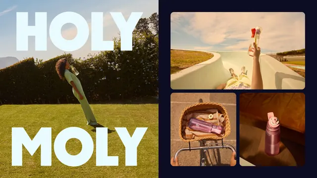
A split campaign layout pairing a sunlit lifestyle photo overprinted with oversized "HOLY MOLY" type against three product shots on navy.
More like this
See all
Summary
A two-part campaign frame: a full-bleed lifestyle photo with a headline split above and below the subject, set beside a navy panel holding three rounded product shots.
Visual description
The left half is a full-bleed photograph shot in low golden light. A person in a mint green short-sleeved jumpsuit leans back mid-drink from a translucent bottle, standing on mown grass in front of a tall flowering hedge with a mountain ridge and pale sky behind. Over the photo, pale ice-blue all-caps display type reads "HOLY" across the top and "MOLY" across the bottom, both set edge to edge so the letters crop against the frame and the figure sits in the gap between the two words. The right half is a solid deep navy field carrying three rounded-corner photos: a wide top shot looking down a curving concrete skate bowl, a hand raised into frame holding a clear bottle with a red cap; below it, a wicker bicycle basket lined with a towel holding a lilac and pink bottle, a green flavor pod resting on the towel; beside that, a dusty rose bottle with a pink loop cap standing on a table in warm low light. Navy margin separates every tile.
Key takeaway
Splitting one headline above and below the subject turns the photo into the middle of the sentence, which gets oversized type onto an image without covering the action. Setting the supporting product shots on flat navy lets six different bottle colorways sit together without clashing.
Reuse notes
Good for a campaign page, a case study spread or a social carousel frame where one hero image has to share space with product detail. The type sandwich needs a subject with clear headroom and footroom, so it fails on tightly cropped portraits. The navy is doing the neutral job here and any lighter panel would let the product tiles compete.