Preview image. Unlock full-res
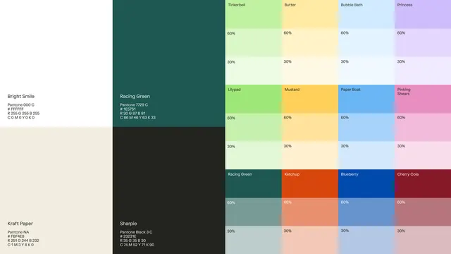
A systematic color swatch grid showing tint and shade variations for six Pantone colors, labeled with percentage breakdowns and CMYK values.
Summary
A systematic color specification sheet showing six Pantone hues with their 60% and 30% tint variations, complete with Pantone numbers, hex codes, and CMYK breakdowns.
Visual description
Left side shows two swatches with full specifications: Bright Smile (pale cream, Pantone 000 C) and Kraft Paper (greige). The central and right portions display a grid of rectangular color blocks arranged in horizontal pairs, each with a 60% row and 30% row below. Named colors include Racing Green (deep forest teal), Timberbell (warm taupe), Butter (pale yellow), Bubble Bath (sky blue), Princess (soft lavender), Llypad (pale mint), Mustard (golden yellow), Paper Boat (periwinkle), Pinking Shears (hot pink), Ketchup (burnt orange), Blueberry (royal blue), Cherry Cola (wine red), Sharple (charcoal), and a few others. Small sans-serif labels show color names and percentage markers alongside CMYK notation.
Key takeaway
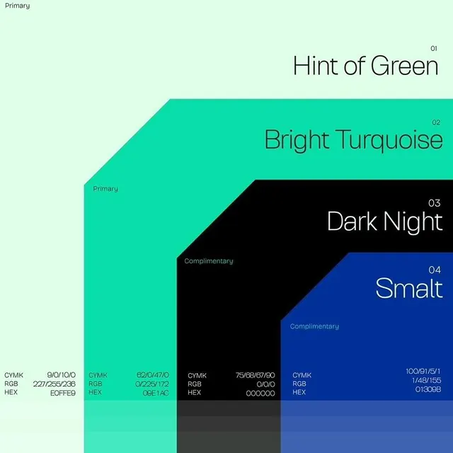
The layout pattern for communicating color systems: pairing named colors with technical specs (Pantone + hex + CMYK), showing tint/shade progression, and grouping at a glance. The label placement is clear without cluttering the swatches themselves.
Reuse notes
Use as a template for brand color documentation, color palette exports, or design system specifications. Works well for print + digital guidelines where both Pantone and digital specs matter. The percentage breakdown is useful for showing approved variations on a core color.