Preview image. Unlock full-res
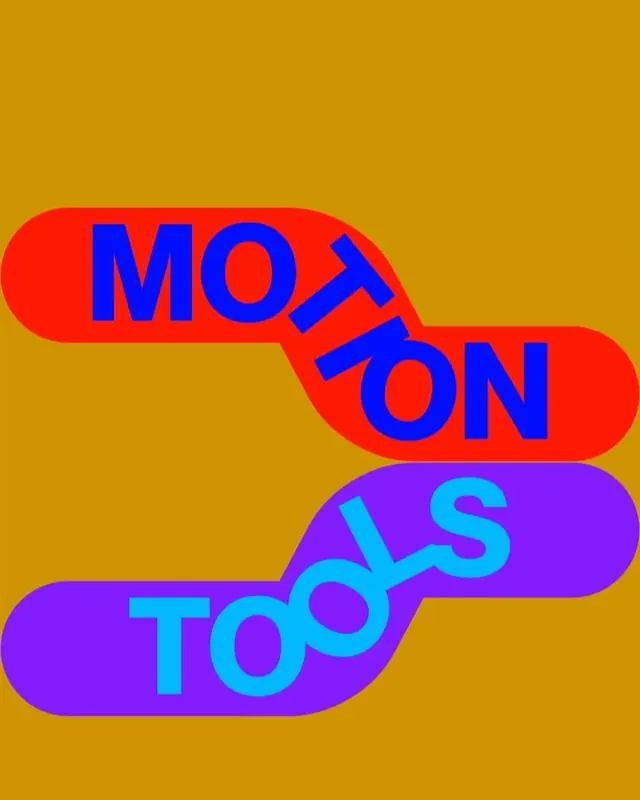
A vibrant two-tier wordmark using rounded rectangular pill-shapes in red and purple, stacked vertically with contrasting neon typography on a mustard background.
Summary
A two-tier logo using vibrant neon color blocking: red pill-shape with blue "MOTION" stacked above purple pill-shape with cyan "TODS" against a mustard background, embodying bold, retro-playful branding.
Visual description
Two horizontally-oriented rounded rectangular pill-shapes stack vertically at a slight offset. The top pill is bright red with "MOTION" rendered in bold blue sans-serif capitals. The lower pill is deep purple with "TODS" in bright cyan sans-serif. Both text elements use the same weight and scale, creating visual consistency despite the color shift. Set against a warm mustard/gold background, the saturated primary and secondary colors create high-contrast, almost neon intensity. The curved pill boundaries soften the geometric nature while the bold sans-serif maintains graphic authority.
Key takeaway
The color-blocking strategy using complementary hue pairs (red-blue, purple-cyan) creates visual energy without complexity. Staggering the pill-shapes horizontally adds dynamic asymmetry while maintaining vertical alignment. The pill-shape container unifies disparate colors into a cohesive wordmark.
Reuse notes
Effective for brands targeting youth, culture, and creative sectors seeking memorable, high-impact logos. Works well at any scale due to clear silhouettes and bold typography. The saturated palette may overwhelm if paired with complex imagery; best applied on solid backgrounds or used as a standalone mark.