Preview image. Unlock full-res
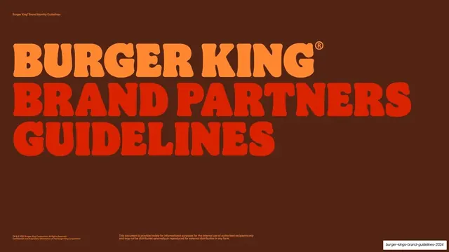
A 129-slide brand guidelines deck built on Burger King's retro revival identity, pairing chunky rounded all-caps display titles with a flame-colored palette of orange, red, brown and cream.
Summary
A 129-slide brand-partner guidelines book for Burger King's 2020-era retro rebrand. Its personality is one chunky, rounded, all-caps display face set huge, run across a tight flame palette of brown, orange, fiery red and cream, with the Whopper cross-section turned into a graphic stripe system.
Visual description
Slides are 16:9 and cycle through three background treatments: deep BBQ-brown section dividers, full-bleed flaming-orange dividers, and warm cream content pages. Section-divider slides carry a single oversized all-caps word ("INTRODUCTION", "OUR STORY", "DESIGN STRATEGY", "ILLUSTRATION: STRIPES") in the brand's rounded retro display cut, top-left aligned and bleeding wide, in orange-on-brown or brown-on-orange. Content pages use a fixed two-zone layout: a small bold left sidebar label and a large right-hand text column set in a sturdy slab serif, on cream. A consistent utility frame runs on every slide, with "Burger King Brand Identity Guidelines" top-left, the section and subsection stacked top-center, the page number top-right, and a two-line legal credit bottom-left. The illustration system is the standout: "primary stripes" abstracted from a Whopper cross-section (orange bun, green lettuce, red tomato, cream mayo, brown patty) drawn as torn-edged horizontal bands, plus flat playful ingredient drawings (onion rings, pickles, tomatoes) layered behind product-in-wrapper photography. The palette holds across brand red, flame orange, fiery red, BBQ brown and mayo egg-white, with a green reserved for the plant-based variant.
Key takeaway
Building an entire 100-plus-slide system from one personality typeface set oversized and all-caps, paced by alternating solid-color dividers so the deck never feels monotonous. The smartest move is turning the hero product's cross-section into a reusable graphic-stripe asset, so the brand's illustration language is literally made of its own food.
Reuse notes
A strong reference for any large brand-guidelines or brand-book deck, especially food, beverage, retail or consumer brands that want warmth and personality over corporate sterility. The divider-then-content rhythm and fixed running header/footer are directly reusable for any long reference document. The chunky retro display face and torn-stripe illustration are bespoke to BK's revival; swap them for your own brand assets. Works best when paired with strong food photography and a deliberately limited warm palette.
From this deck: Burger King Brand Partners Guidelines 2024
View deck