Preview image. Unlock full-res
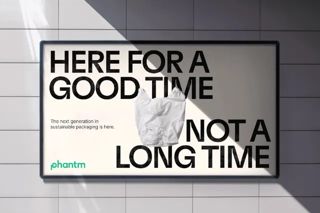
Stark black sans-serif headline positioned against a light gray panel, casting a hard shadow onto a tiled surface, with a small green logo anchor below.
Summary
A typographic composition using large black sans-serif words stacked on a light gray wall panel with sharp cast shadows, featuring a small green logo lock mark beneath the text.
Visual description
A light gray wall panel is the main field, shown in perspective with a gridded tile floor beneath. Two lines of black all-caps sans-serif type are positioned center-left: "HERE FOR A" on the first line, stacked with "GOOD TIME" below and "NOT A LONG TIME" offset to the right. The letters cast hard geometric shadows across the panel. Below the text sits a small green rectangular logo seal or lock-mark mark, approximately 40px. The composition emphasizes the interplay between clean typography, negative space, and the dimensional quality of shadow.
Key takeaway
The interplay of letterforms and their shadows creates a dynamic, three-dimensional read despite flat typography. The offset lines create visual tension and guide the eye through the message. The small colored mark at the base acts as a silent brand anchor that balances the composition without competing with the headline.
Reuse notes
Effective for sustainability or lifestyle brands with direct, confident messaging. The shadow technique works particularly well in photography-based advertising, presentations, or environmental graphics. Requires careful typeface choice and kerning; works best with geometric, modern sans-serifs. Not ideal for screen displays; more suitable for print or large-format campaigns.
More like this








Keep what you find
A free account saves references to boards and can send you a weekly email of picks based on what you save.
To see every result, go Pro.