Preview image. Unlock full-res
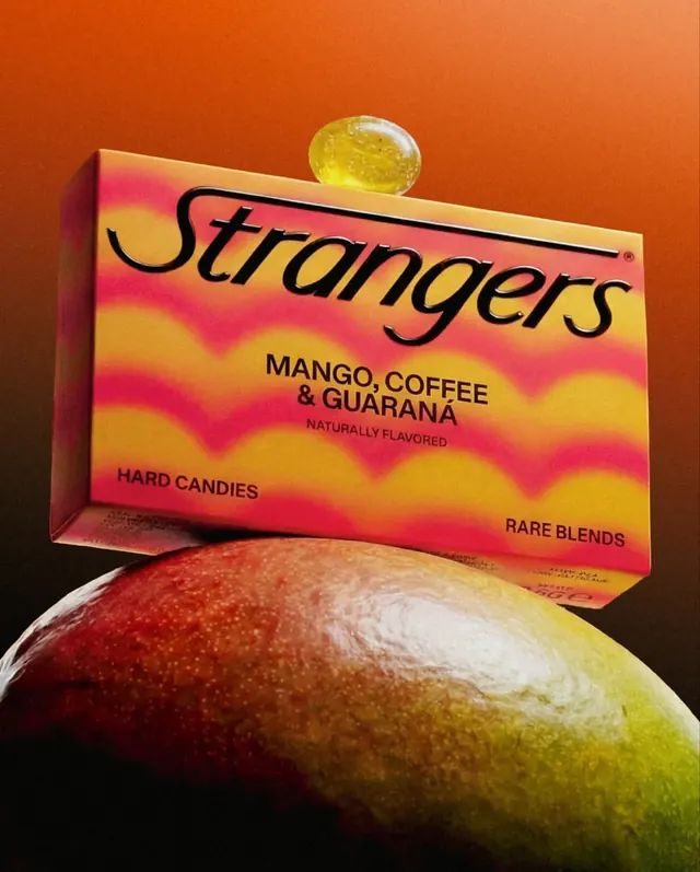
Vibrant gradient candy packaging with bold italic logotype and tropical flavor callouts against a saturated orange product backdrop.
Summary
Vibrant gradient candy packaging with bold italic logotype and tropical flavor callouts (Mango, Coffee, Guarana) for Strangers hard candies, shot against a warm orange background.
Visual description
A rectangular candy box tilted in a 3D perspective, positioned diagonally in frame. The box features a bold diagonal color gradient from hot pink at the top to bright yellow at the bottom, with sharp wavy stripes dividing the zones. The brand name "Strangers" is rendered in a flowing black italic serif or display typeface. Below, sans-serif callouts in black and magenta label the flavor (Mango, Coffee, Guarana), product type (Hard Candies), and marketing phrase (Naturally Flavored, Rare Blends). A translucent mango or fruit sphere floats above the box; below, a glossy whole fruit (mango or apple with red-to-yellow gradient) anchors the lower half. The surrounding background is a warm burnt orange, creating high saturation overall.
Key takeaway
The color gradient as primary visual anchor: rather than a flat field, the wavy striped gradient does all the work and lets the product and typography float. The flowing italic mark is memorable at scale. Text hierarchy via size and weight (brand big and loose, callouts smaller and tight) reads clearly despite the busy background.
Reuse notes
Strong for artisanal or exotic food brands targeting playful, confident positioning. The gradient is polarizing, so it pairs best with brands confident in bold color. The fruit photography adds legitimacy; works well for "naturally flavored" positioning.
More like this


Keep what you find
A free account saves references to boards and can send you a weekly email of picks based on what you save.
To see every result, go Pro.