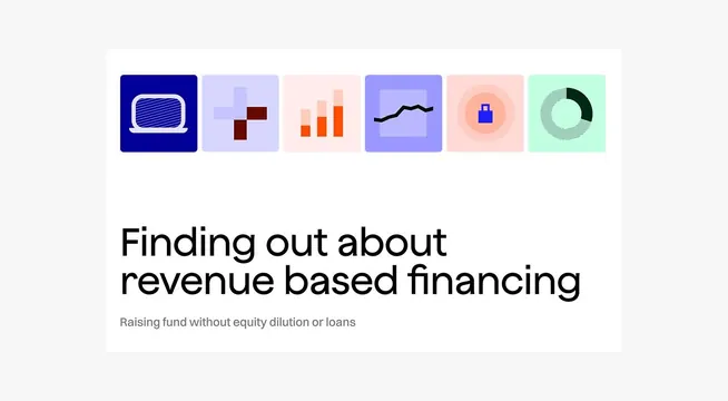
Preview image. Unlock full-res
A six-icon data visualization set in bold color blocks introducing revenue-based financing concepts: dark blue screen, light purple scatter chart, coral bar chart, purple trend line, peach security lock, and mint pie chart.
Summary
Six flatly-styled data visualization icons in bold pastel colors (deep navy, lavender, coral, peach, mint) introducing a financial product about revenue-based financing.
Visual description
A horizontal row of six square icons with rounded corners, each a different solid color: dark navy with white line-icon of a monitor, light lavender with a dark maroon scatter plot, pale coral-pink with orange bar chart, soft purple with black trend line, peachy-pink with blue security padlock, mint green with dark pie/donut chart. Below the icon set, large black sans-serif headline reads "Finding out about revenue based financing" with a gray subhead "Raising fund without equity dilution or loans."
Key takeaway
The distinct color-per-icon approach makes each concept immediately scannable and memorable. Simple line or geometric chart shapes inside solid backgrounds are readable and grid-friendly. The paired headline and descriptive subhead establishes financial authority without jargon density.
Reuse notes
Ideal for fintech onboarding, explainer slides, or investment-focused web pages. Works on light backgrounds and scales well for mobile. Use when you need to introduce multiple financial concepts quickly. Each icon color should reflect its concept (security = blue, growth = green, risk = coral).
More like this






Keep what you find
A free account saves references to boards and can send you a weekly email of picks based on what you save.
To see every result, go Pro.